This article was originally posted on the Design for Geeks website: a project I have now archived. I have also presented versions of this article as a conference talk: for instance, Colour is an Opinion at WordCamp Asia 2023 Opens in new window.
Colour in web design is an essential element: we need to get it right.
When we design for the web, we’re sometimes conditioned in our colour choices by the colour palette of the brand we’re building the site for. However, when using colour in web design there are many other factors that we must consider when we choose colours and put them to work in our user interface.
This post gives you vital information on what you must consider when making your colour choices in web design. And guess what – it’s never based on personal preference.
What is colour for?
Before we learn more about how to use colour in web design, let’s have a look at colour in general. What is it for, besides bringing us happiness and visual variety? I am a colour junky. Beautiful colours make my soul sing. But there’s more to colour than unbridled joy.
First and foremost, colour is extremely helpful to us in our everyday life. Colour helps us identify objects and their function.

For instance, colour provides essential information when we select fruit at the supermarket, which was vital to our ancestors when they had to identify edible berries from poisonous ones when out foraging.
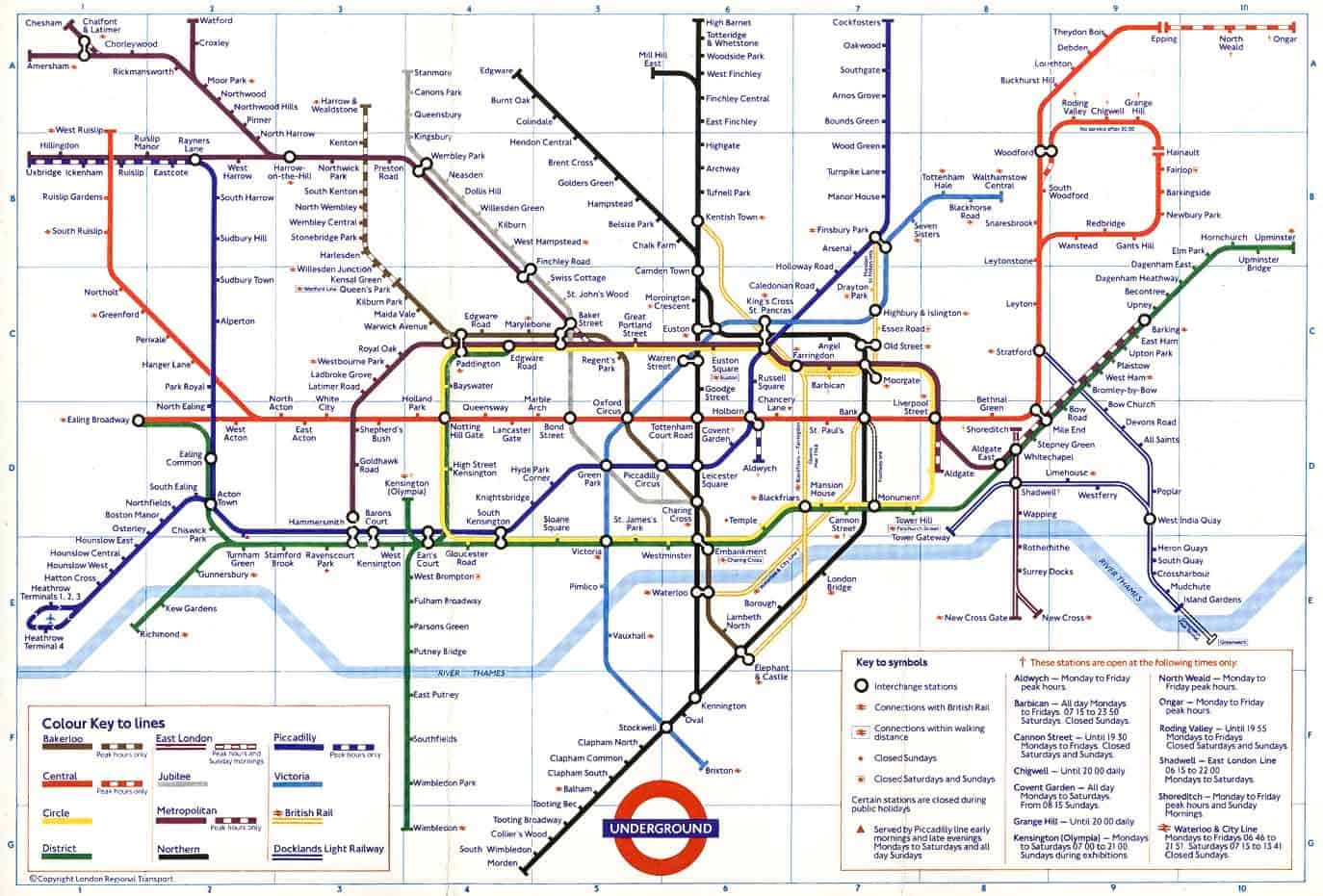
Colour is also a very useful tool when we create navigational systems. In the case of the London Underground, we’re used to identifying a tube line immediately by its colour.
This map – an evergreen design classic – also uses the lines’ names and their position on the map as means of recognising them: this is because any system that relies on colour only is largely set up to fail. Colour, to a point, is an opinion – and we’ll see what I mean by that later on.
Colour both in the built world and in nature also serves to provide a warning. Colour screams out ‘don’t eat me’! or ‘make love to me’
It can literally yell out “KEEP OFF! I’m extremely dangerous”, as is the case with this vibrantly coloured AND lethal poison dart frog, or “make love to me”, as is the case with the gorgeous plumage of a bird of paradise.

And although in general the interpretation of colour is heavily influenced by local history and culture, there are international conventions such as traffic lights, that mean that these days red is perceived as the colour that makes you stop, yellow the colour to get you to pay attention and be careful, and green the carefree signal that all systems are go and you can proceed safely. As far as I know, this is the one colour convention that’s accepted globally, with no exceptions.
Even so: notice how the vitally important message doesn’t just rely on colour. It also relies on the position of the lights. If you were unable to tell the colours apart with sufficient certainty, you would still know what to do simply by the position of the lit circle.

In a nutshell: colour helps us navigate life, as well as the web.
Colour in real life vs. colour in web design
Please let me utter this platitude: colour in real life is very different from colour in web design.
Why? Well, it’s a matter of light, but also, a matter of perception.
According to the dictionary, the colour of something is the appearance that it has as a result of the way in which it reflects light. And that’s for the real world.
On the web, colour is made by light, it lives in it, and is in fact light itself. In both cases, the web and real life, colour lives in light.
This may seem obvious to us now, as web professionals working with monitors all day long. However, it wasn’t always the case: the English scientist Isaac Newton was the first to connect light and colour, in the 1660s.

How Newton discovered where colour comes from.
In the late 17th century Isaac Newton was carrying out optical experiments in a dark room. In one of the experiments Newton had a narrow ray of light coming in from the window which then went through a glass prism in the shape of a pyramid, and was projected on the opposite wall. The passage through the prism fragmented the light into a sequence of interconnected colours similar to the physical phenomenon of the rainbow.

The experiment had started as a study on optics and ended up shifting perspectives on matter: metaphorically, light can be opened up and fragmented into colours. Colour, for the first time, is seen as being a quality that exists within light, rather than ‘on’ things.
Also, for the first time a list of colours did not include black and white, which are now simply forms of light and darkness. Furthermore, colour is now a continuous gradient composed of undefined passages, which could mean that there could be many more colours than previously thought possible.
So colour in optical science and colour in art become two different things. White and black are are respectively the full presence of light, and the total absence of it. This was a huge conceptual shift at the time.
Reminds you of anything?
Colour in web design has white as the sum of all colours, and black as the absence of all colours: on the web, we operate according to the Newtonian colour model.
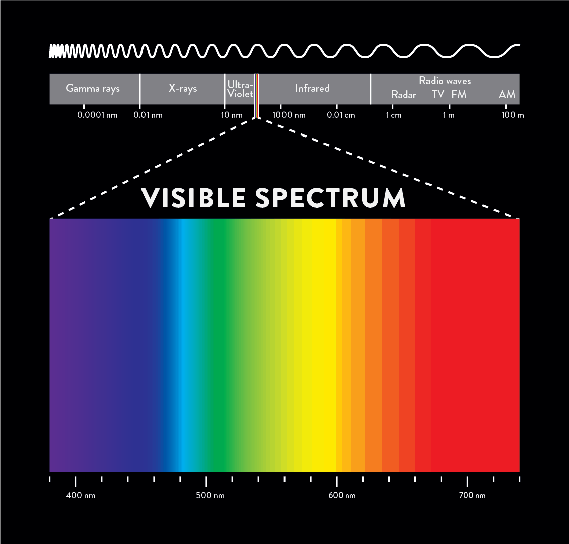
The colour spectrum

The multicoloured ray of light that Newton conjured up to life in his experiment is an exemplification of the visible light spectrum, or ‘colour spectrum’.
Spectrum, in Latin, means ghost – that is to say, something invisible. In fact, the colour spectrum is the only part of the entire electromagnetic spectrum, coming from the sun, that we can actually see.
The other wavelengths outside the visible light spectrum such as x-rays, infra-red, radar, FM, AM and so on, are not visible to us, even though we use them in our every day life in one way or another.
So as you can see here, this spectrum goes from red to violet, and it doesn’t include black or white. White is a mixture of the colours of the visible spectrum and black is a total absence of light.
Colour is light.
So, as a result it is essential first of all to understand that colour is created by light. Without light, we cannot see colour. Both in real life and the web – however, the behaviour of colour is very different in the two cases.
Fast forward from Newton’s experiment to colour on screens and the internet: Newton’s radically new take on colour is the same concept that we use in colour in web design.
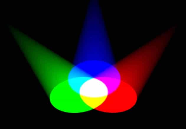
In the image below, you can see a visual representation of the RGB colour system, in which colour is created by light.
If you are web pros, you probably know all this already. I’ll repeat it, so that we are all up to speed on this.
The RGB acronym stands for Red, Green and Blue: the primary colours for the RGB system. When they overlap, they form white. This is why they are called additive colours: they are colours obtained by emitted light directly from a source, and when the three primaries overlap, the result is white light.
RGB colour is made of LIGHT. Red, Green and Blue are LIGHT BEAMS.
So, right off, this is the difference between RGB and the real world.
In the real world, this is completely different because any colour system is based on light bounced off a surface. It’s not transparent: it’s reflective.
Here is an example of the same red, green and blue colours in the real world, where most objects get their colour through a combination of reflection, absorption and scattering of the light that hits on them. And, I would add, very importantly, also as a combination of cultural, environmental, psychological and physiological factors – as we’ll see in a short while.
(Here’s the Wiki on colour for the proper nerds among you. I am keeping it simple here.)
If any of you has ever printed anything and been surprised by the results, this is why it happens. It’s apples and oranges: a fruit, yes, just not the same fruit.
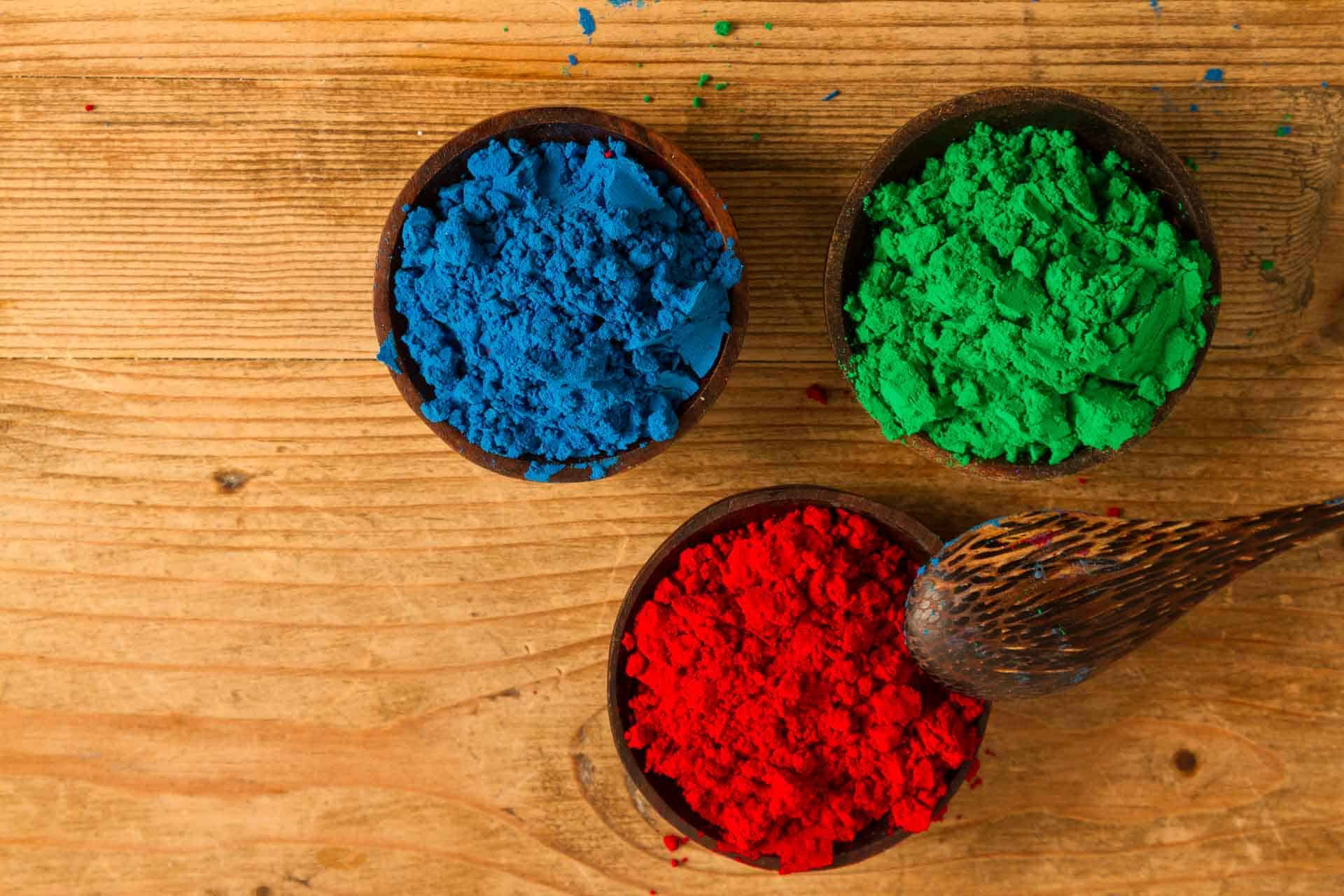
The colour model used in colour theory and in the real world is called RYB, that is to say, red, yellow and blue as the primaries. When the primaries overlap, you get black.
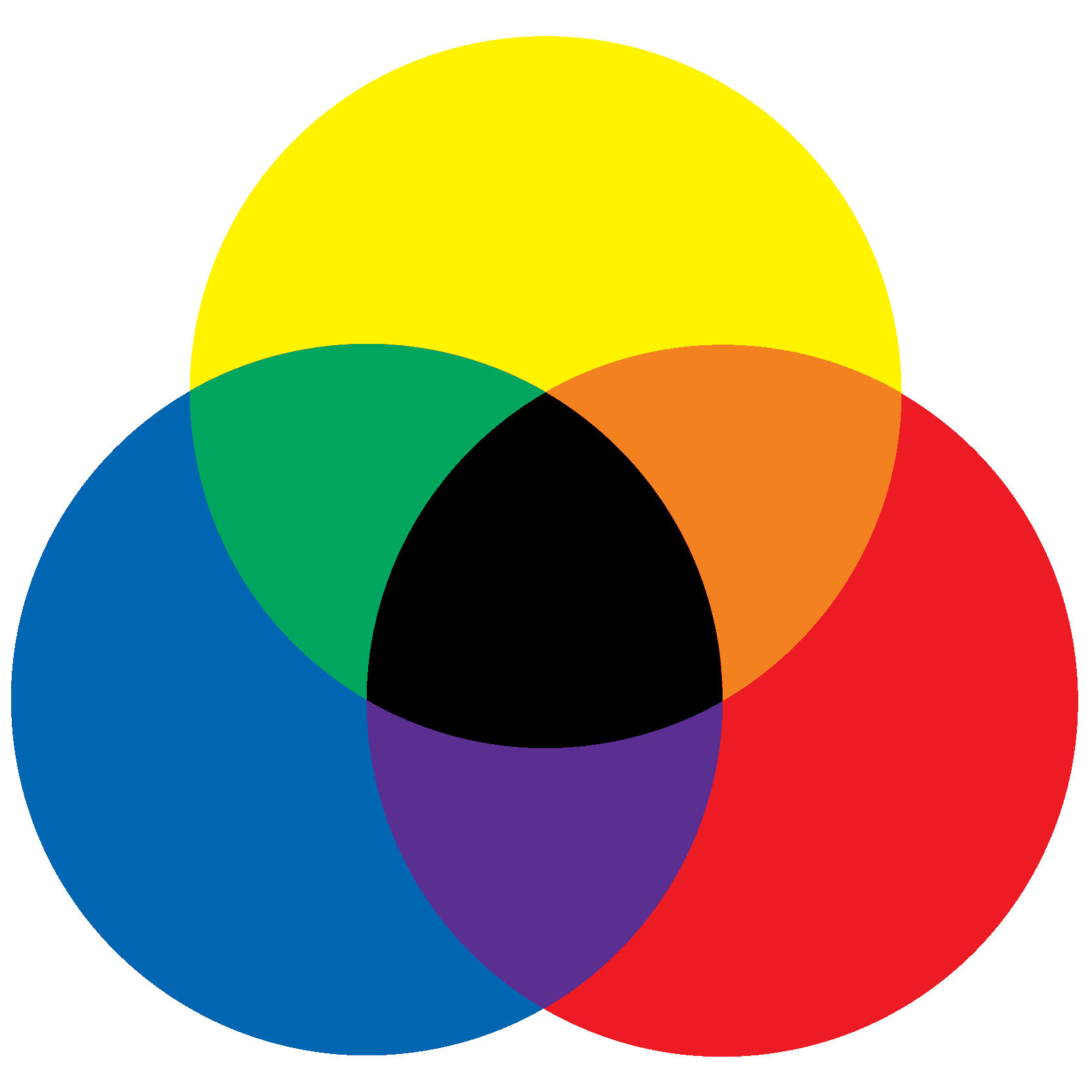
As we’ve said, on the web we use the Newtonian colour model, which means that when the primaries overlap, you get white.
The RGB colour system comprises a very wide range of colours (called gamut). Each of the three primary rays of colour has 256 levels, from 0 light to 255.
If you multiply the levels of the 3 RGB values, 0 to 255, by one another, you get nearly 17 million colours:
256x256x256 equals 16,777,216. That’s nearly 17 million! We are most definitely spoilt for choice when it comes to colour in web design.
Most top of the range modern monitors do reproduce the entire RGB gamut – for instance Apple monitors.
The problem with this huge plethora of colours at our disposal is that it’s difficult to get our heads around how to organise them, arrange them and choose them.
And here we go again back to Newton: he was the first to put the sequence of colours he obtained from the prisms on to a circular wheel. The colour wheel is a circular diagram with a logically arranged sequence of colours.
The great novelty regarding this was that, first of all, he worked out that by juxtaposing the light from different prisms you could create more colours. On top of that, putting all those colours on a circular wheel provided for the first time a way to reason about colours, creating relationships between them and starting to give us a way to organise them and make a choice.
Many other iterations of the colour wheel have been produced since then. And that’s an interesting story: we’ll go deeper into it in another post.
Getting closer to a visual theory: Goethe’s studies on colour
In fact, it wasn’t Newton who laid the foundations to the the theory of colours as mostly based on a colour wheel. It was Johann Wolfgang von Goethe, a German Romantic (i.e. belonging to the Romantic movement) who wrote two books on colour, devoting most of his last years as a writer to the subject.

Goethe was born in 1749: in the second half of the 18th century Newton’s prisms became a very fashionable gadget to have in salons and clubs, so he would have seen many in the high society circles he frequented.
Goethe took a diametrically opposed attitude to colour to Newton’s. Newton concentrated on colour as the essence of light, whereas Goethe focussed on colour as a phenomenon, that is to say, how it is perceived in every day life. He was basically antiscientific, as most romantics were.
In fact, Goethe thought that Newton’s theory was way too abstract and it didn’t take real life and human perception into consideration.
He argued that colour needs matter to be seen, and that aside from the light prism, colour as conceived by Newton didn’t, in fact, exist or have an application in real life. I think he had a point there.
Goethe also didn’t agree that darkness is absence of colour, and he argued that colours change with shade, but they are still colours and not the absence of it. Again – good point.

The German painter Philipp Otto Runge, who was a friend of Goethe’s, created this spherical representation of the colour spectrum, published in his Colour Sphere manuscript in 1810. Runge’s spheres had white and black poles with coloured stripes running between them. This model had as its limitation the lack of differentiation between brightness and saturation, which meant that the resulting model had little variation in colour intensity.
It was, however, important in the history of colour theory because it represented a step forward into the real world from Newton’s model, and a step closer to modern colour theory as we know it.

Jump forward a couple of centuries, brazenly skipping Itten, Albers and other important colour theorists such as the amazing Emily Noyes Vanderpoel, and here you have the 12-colour wheel that you’ll find as the basis of uncountable colour harmony cheat sheets and tutorials on the World Wide Web.
The colour wheel
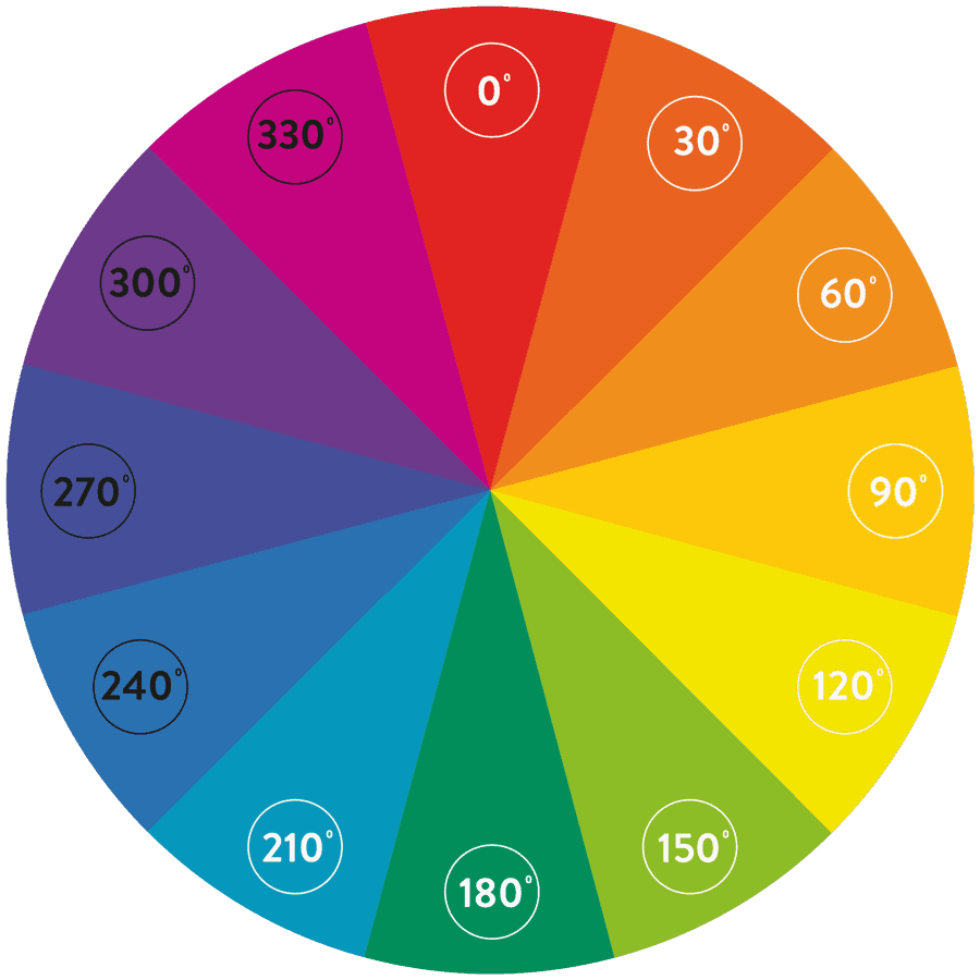
There you go: the modern colour wheel, with 12 colours. You’ve seen it before, I’m sure. There hundreds, probably thousands of tutorials on the web teaching you how to use colour harmony to create your palettes.
And by now you probably think that I’m going to suggest you build your colour palettes for your UI based on this.
Surprise!
I’m not going to do that.
To the question
‘Should I go and create the colour palettes for my UI using colour harmony?’
The answer is:
NO.
Unless you are really confident with colour, or aspire to be, don’t use colour harmony to build your palettes.
Colour harmony is a mine field and it gives you zero guarantee that your palettes will be accessible. The one thing that you do need to know so that you can avoid it in your UI, has to do with complementary colours.
Complementary colours: know them so you can avoid them.
Complementary colours sit opposite to one another on the colour wheel. This concept of opposite colours was first introduced by Goethe’s wheel – not Newton’s. Like most opposites, they attract but they also repel.
So this is what I want you to know about complementary colours: Never use complementary colours directly next to one another or on top of one another for text colour schemes. The combination would be illegible. And although colour is, largely, an opinion, this one is a fact.

Red against green has got all sorts of counter-indications, the first one being that the most common type of colour blindness pathology makes it impossible for sufferers to differentiate accurately between the two.
As far as I’m concerned, looking at the phrase above on my computer screen actually hurts my eyes. The green and the red clash and vibrates and I feel mildly sick. Complementary colours have far too much hue contrast to be legible when on top of one another.

What also happens when you look at an image with this level of strong contrast for too long – aside from the possible side-effects people like me might experience– is that if you look somewhere else after having stared at it for while, you’ll see its phantom image wherever else your gaze will move. Personally, I suffer from a minor vision pathology called high persistency in the retina which makes this visual effect much worse than normal. It’s not real: it’s in my head. But I see it, constantly. So, to me, it’s real.
The colours in our head
What does this remind you of? If you stare at the green-on-red or green-on-pink phrases and then look elsewhere, you’ll experience something similar to what you see in the image above: you see that image again, only in reverse.
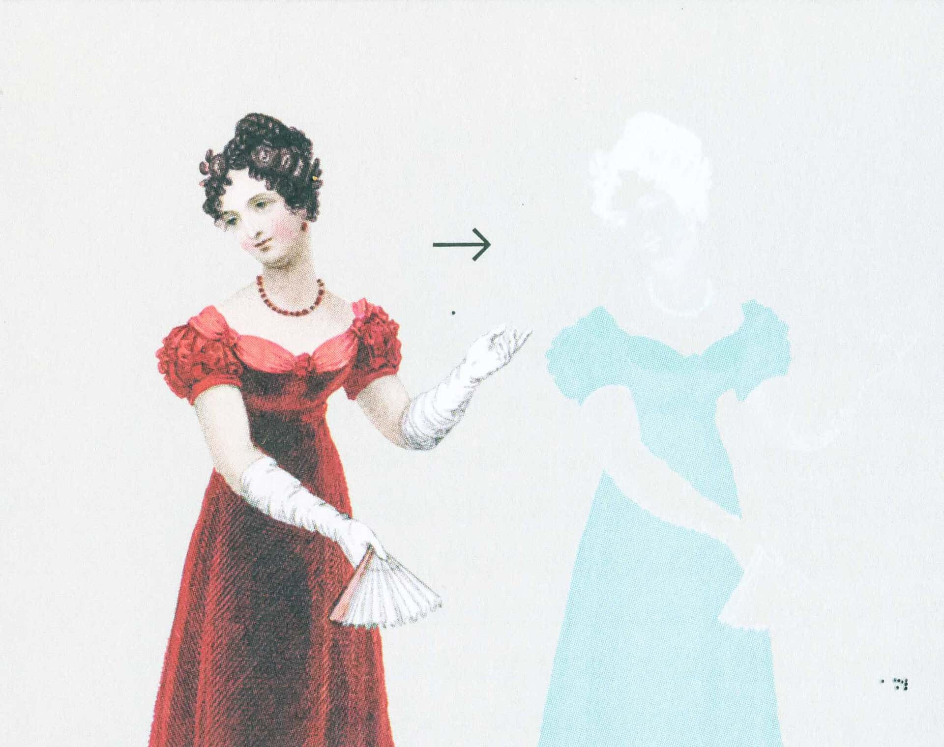
Goethe was the first to observe that certain physical phenomena can completely change our perception of colour.
One day, he saw a lady with a white complexion and very dark hair, in a red dress. He stared at her, fascinated by the strong colour combination, and then looked at the white wall next to her. He saw a phantom image, with reversed colours.
The phantom colour produced in this phenomenon is called posthumous colour, and it’s kind of a much paler version of the complementary colour to the colour we project.
So in fact Goethe concluded that our mind can actually produce colours, which was a revolutionary idea at the time. He also conducted other experiments, such as a candle in the sunset, which proved that we can interpret reality to see colours that are not actually there, based on our perception and on ephemeral environmental conditions.
The colours are in our head sometimes – not in the real world. But does it even matter? If they are in our head, they are real to us.
Colour is an opinion
Here’s what the point is:
Colour is, largely, an opinion.
The way we see colours as individuals is based on an unpredictable set of variables including culture, psychology, physiology and the environment we or the colours we see are in.

For instance – Is this blue or gold? Let me just get the popcorn out…
Whenever I show this image when giving this presentation to a live audience, the environmental conditions are the same for all the people in the room.
Same lighting, same everything.
And yet, the room is divided into two factions: those who see the dress as blue, and those who see it as white and gold. Both sides think the other one is, possibly, stark raving mad.
It is so strange, when a few hundred people in the same place at the same time see the same thing in a completely different way.
And the even more interesting fun fact is that, invariably, there is a third or fourth colour truth coming out of a member of the audience: there is always someone putting their hand up to say that they see the colours on the dress in yet a different way.

The same thing happens with this trainer.
I clearly see it as pink and white, which is what it actually is in the real world (if you still believe such a notion can exist!), even though I do see the greenish tinge caused by the bad lighting and bad lens.
I usually get it right when interpreting a colour image, because I am also a photographer and I have played with colour all my life. My eye immediately calibrates, taking out the wrong data and churning out the correct coloration.
Imagine my utter shock HORROR when I opened this image in Photoshop and the colour picker actually proved to me beyond a shadow of a doubt that what I clearly see as pink is in fact grey.
There is always more cyan than magenta, and there is very little black. The final result in the colour picker, at any rate, is definitely a grey and not the pink I see.
There is no absolute colour truth, either with colour in web design or colour in real life.
The main point is, however, that
- Colour IS an opinion and
- every single colour opinion is 100% valid. Your opinion is valid as mine, i.e. your colour vision is as valid as mine and viceversa.
There is no absolute colour truth.
The most important lesson we can draw from this fact/ non-fact of life is that colour can’t be chosen on a whim, because you run the very serious risk of making your UI inaccessible.
This is a fact that your clients need to understand when they base their colour choices on personal preference. It simply won’t do – and not so much because of colour psychology, or the best colour for a certain industry: you can tell them that it’s because of accessibility.
Colour blindness
The reality is that most people haven’t found out yet that they have a form of colour blindness. In my family, we realised that my brother couldn’t tell red and green apart when he was well into his thirties and trying to wear a tie that clashed horrendously with his suit.
Approximately 8% of men and 0.5% of women have some form of colour vision deficit. Women usually carry the gene but don’t suffer from it.
These are the different types of colour blindness.
- Protanopia
- Deuteranopia
- Tritanopia
- Protanomalia
- Deuteranomalia
- Tritanomalia
- Achromatopsia
Thankfully, you don’t need to learn them all because these days we have wonderful tools on the web to help us work it all out.
By the way – I am not, specifically, an expert in all this: I have just educated myself so that I make sure everyone can use the websites I design. And I’m helping you do the same.
So, that’s why it’s better not to rely on hue when using colour in web design.
People with colour blindness issues have problems with hue, but they can see differences in brightness or saturation.
This is why you should always test a design in black and white/grayscale before you colour it – or at least test it afterwards.
Create good UI with HSB
Let’s have a look at a couple of sure-fire ways of creating a safe and accessible UI for your websites, without relying on hue.
This methodoogy also allows us to avoid colour theory altogether.
Instead of trying to create complicated colour palettes, we can just use colour attributes to create simple colour systems for your websites. Think of big brands such as Facebook or Linkedin: they only ever use brightness (or very slight hue) variations in their UI. That should be convincing enough.
The three basic colour attributes that you can manipulate to change the appearance of colour as well as its nuance of meaning are hue, brightness and saturation. You are probably already familiar with these essential terms, even from adjusting your TV or computer monitor.
Hue, Brightness and Saturation
The term hue refers to a specific colour, for instance red or yellow or blue. Simply put: hue is just another way to mean ‘colour’.
The brightness attribute refers to the amount of light present in a colour, that is to say its level of lightness or darkness.
The degree of lightness and darkness in a colour can also be referred to as ‘value’. The darker end of a hue has a low value; the lighter end a high value.
The term saturation refers to the degree of intensity (also referred to as ‘purity’, or ‘ chroma’) of a colour. I prefer to use intensity, however, because if you use purity then you imply that less saturation means less purity, as if you were somehow adding impurity to a colour, while all you do is take away intensity from it.
Hue is a number between 0 and 360, measured in degrees, because in fact hue is nothing other than the position of the colour on the wheel. This is quite handy to remember.
Hue only refers to this, ignoring entirely how rich or how bright a colour is. Which comes in very useful, as we’ll soon see.
Breaking up a colour
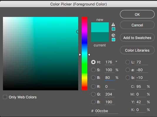
This is a Photoshop colour picker but you could use any. We can ignore Lab colour and CMYK colour on the right: on the web, what matters to us are the 3 colour models on the left, that is to say HSB, RGB and hexadecimal.
As you can, 176°is in fact a green/ teal colour, which works with what we just saw on the wheel. And even if you don’t see that colour as green, it will still have the same position on the wheel – this, as least, is a fact.
Then we have 100% saturation and 5% brightness. These values are completely independent from hue. Then below we have the representation of the exact same colour as RGB and as hexadecimal – exactly the same colour, expressed with a different formula.

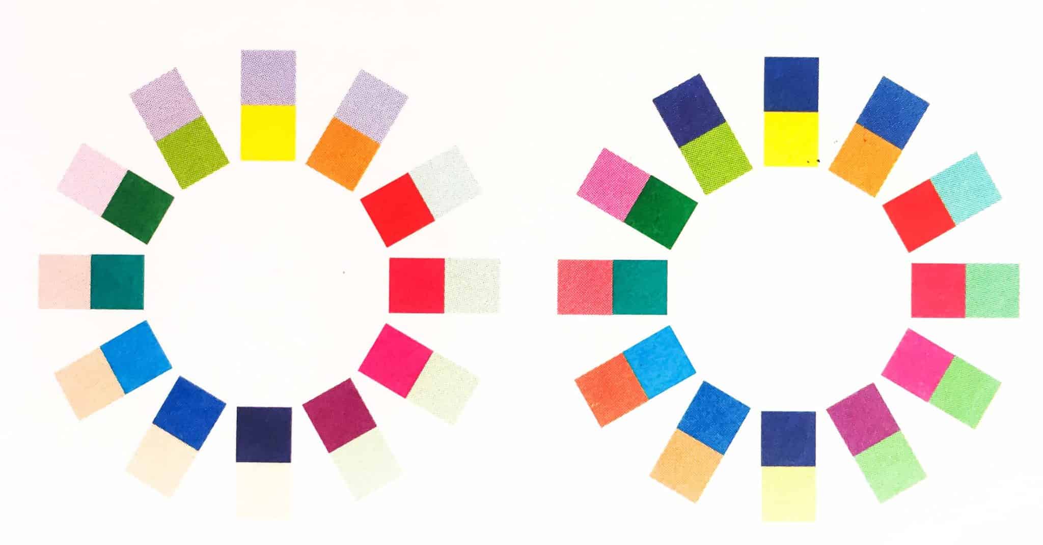
So this is the green hue (176°) we saw above in different degrees of saturation. The less saturated a colour is, the greyer it looks, because we are taking away colour from it. However, brightness and hue remain exactly the same as before.
This is a quick and easy saturation palette and a valid method, although not my favourite one as it can end up being quite bland and a bit boring and monotone.

I much prefer creating variations with brightness, which has much more effective results.
The Brightness of a hue is a number between zero and 100. Like saturation, it’s sometimes written as a percentage.
It’s important to note that there are two situations for brightness.
When the brightness is zero the result is black, regardless of hue or saturation (remember? No light=no colour).
When saturation is zero but brightness is 100, you get pure white.
When there is saturation (i.e. there is a hue) and brightness is up to a 100, you get a very bright colour, as if you were shining a light on it (or through it).
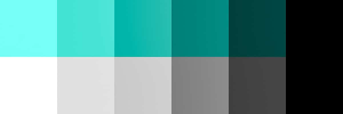
The cool thing when you look at the scale above of very dramatic colour changes is that in fact the hue hasn’t shifted a degree: it’s still exactly the 176° that we started from.

So let’s say that a client hands over their brand’s palette, which has the teal 176° hue as its main brand colour.
Let’s say that the teal colour in the colour picker above is the colour for links on the website I am designing, because it is the main colour in my branding palette.
I want to keep things muted and simple in the hover, active and current page states and I also need to keep to that exact hue because of the branding.
When using the HSB colour model, I know that if I simply take down the saturation and/ or the brightness, I can end up with colours that are of that exact same hue – only less bright or brighter or less saturated.
So the HSB colour system can be useful when working with brand colours: you can create a brand palette that maintains the same hue of the main brand colour, only by changing its brightness.
If your client hands you a colour palette with a very strong accent colour, only use it in accents, especially if it’s complementary to the main colour.
If they give you a hard time about it and ask you to use all the colours of the rainbow, besides the colour blindness card you can also play the Facebook or LinkedIn card: those are huge brands that only use ONE main colour in their UI. Never more than that. So, follow their example.
Colour blindness testing tools
Are you sure you’re not even vaguely colour blind? You can test yourself on enchroma.com. Enchroma sell colour-correction glasses (which, I am told, are not actually a miracle solution), but they also have a fun colour blindness test that you can take to find out whether you have an un-diagnosed colour blindness issue.
Coolors
You probably all already know Coolors – it’s a fantastic colour palette creation tool that also does all sorts of other cool things, it’s almost a one-stop colour shop.

So here’s a palette I’ve created – see how I’ve saved so many on the right. Essentially it’s a monochrome palette with one accent colour, and now I need to test it for colour blindness.

Notice how one of the tools at my disposal also gives me all tints and shades from the colours in my palette.
So for instance I can choose one of the darker shades of my darkest colour for my text colour. If you examine these in Coolors itself, you’ll see that the tints and shades all stick to exactly the same hue, only adding or taking out brightness and saturation. If you want to keep the same saturation then make sure you create your variations manually.
By the way, colour in web design should never be 100% saturated because that causes too much vibrancy on the screen, so make sure you always choose colours with 75% saturation maximum.

Here you can see how I can play with these values as I like. No need of the Photoshop colour picker or any other piece of software in order to create a great palette.

And here I can test the palette for colour blindness by going through the various filters that simulate the vision impairment.
Colour blindness simulation tools
Colorblind-Dalton is a Chrome extension which allows you to test any page, simulating a number of colour blindness conditions.
My favourite app, however, is Sim Daltonism – only for Mac, I believe – sorry! which is not limited to the web, but allows you to overlay a screen simulating colour blindness on any application on your screen.
Check your text colour combinations!
Last but not least: it’s extremely important to also check your text colour and size choices for accessibility. There are many tools that do that these days – at the moment my favourite one is Colorable. It is so easy to use and so granular.

Conclusion
Main takeaways from this post:
1. Colour is an opinion.
2. Don’t choose colour based on personal preference – either yours, or your client’s.
3. Follow basic accessibility rules for colour when creating your UI.
4. Always test it out!
Important notes
This article was originally posted on the Design for Geeks website: a project I have now archived.
Varying versions of this text have been delivered as talks at various conferences around the world. The spoken versions are lighter on the theory, and hopefully more entertaining. The 2023 versions include examples of colours that have completely different meanings and interpretations depending on the culture.
TYPO3 Developer Days 2018 – Düsseldorf
WordCamp Finland 2023
