This article was originally posted on the Design for Geeks website: a project I have now archived. There are various things I’d change now if I were to rewrite this.
The first time I personally got involved in a proper User Experience Design process was when I was working at the BFI Opens in new window, that is to say the British Film Institute in London. I was in charge of the creative direction when the web team was working on a re-design with an external agency.
For that specific project – a huge section of the even bigger and old BFI website – the user experience design was a long and complex process, and it involved working with large teams on both sides, as well as large budgets. It was fascinating and illuminating: I learnt about information architecture, personas, user journeys, user flows, and so on.
And I also learnt what made the real difference between a web project, and a creative concept, or a printed project.
There is no way that the team behind an exhibition catalogue or an art book, for instance, would ever have to think about their users and consider their needs in the same way – if at all. And I know, because I designed books for well over a decade.
So when I went solo on the web and had to work out how to create websites that helped customers as well as the businesses, I asked myself:
Can UX help me? Can I find a way of adapting the user experience design process I’d experienced, so that I create websites that make sense, help the users, and also help the businesses by making sales or capturing leads?
And perhaps even more importantly:
Can I do all this on a small budget and without a team?
The short answer is: yes.
Read on, to find out how I studied, researched, and experimented in order to adapt the large-scale UXD process to the every day reality of us, smaller agencies or solo players, dealing with the needs of small and medium businesses.
What is UXD?
What is UXD, first of all? Is this too obvious a question? No question is too obvious in my experience, not even this one.
However, Don Norman Opens in new window created the first UX job titles when he was User Experience Architect at Apple in the late 90s, so by now, over 20 years later, I think we all know what the acronym stands for: user experience design.

And in fact, come to think of it – What is a website without user experience?
Simply put, it doesn’t exist.
Whether you have thought about it or not, your website or app will give your users an experience.
It’s as simple as that! And pretty much inevitable.
The difference is that if you’ve thought about it and planned your product’s user experience, you’re likely to first of all control it, and you are also highly likely to give the humans that come to your site a better experience – and above all, the experience that THEY want to have.
As opposed to the experience that you *think* they want to have.
Whether you have thought about it or not, your website or app will give your users an experience.
I know that as small agencies or freelances, we may worry that UX is only for big people with big teams and big budgets, and we may feel overwhelmed.
But I know that the process can be adapted to serve anyone.
So if you are a solo agent or a small agency looking to improve your processes by integrating user experience design, as well as giving your clients much better results, this is where I show you how.
Before I carry on, however, I’d like to make another extremely important point.
Good design is good marketing.
Good UXD is as much about design as it is about marketing. And you’ll see in fact how some of the techniques overlap. However, there are things that marketing alone doesn’t do, and that’s where design steps in.
The main components of user experience design
The 3 essential components that are at the basis of a user’s experience of a product are:
- Look
- Feel
- Usability
First the look, because visual experience is essential to establishing understanding, together with credibility and trust;
Then how we feel: is it a joy for us to use this product and interact with it?
And then how functional, predictable and easy to use the product is – that is to say, the usability.
The crucial ingredient of user experience
The happy balance of these three elements results into the best user experience design.
And it’s achieved via a process that has one crucial ingredient: empathy.
Putting yourself in your users’ shoes and actually walking a few miles in them, by their side, is the real secret sauce of user experience design.
Putting yourself in your users’ shoes and actually walking a few miles in them, by their side, is the real secret sauce of user experience design.
Reminding ourselves that ‘users’ are really humans looking for a solution to their problems, not just a number in our Google Analytics stats.
And on this, one important point to make about empathy is that we often over-estimate how much we can empathise, because we naturally project our own experiences onto other people’s, and that can lead to mistaken empathy, however well-meaning.
We actually can’t know for sure how someone else feels, however much we think we’ve tried.
For instance, we won’t know for sure how a pregnant woman feels like until we’ve worn the empathy belly, or been pregnant ourselves; but we could wear a blindfold when using the web or we could unplug the mouse or deactivate the track pad to simulate disability.
This type of empathy doesn’t only improve user experience design: it also improves accessibility.

Just make sure you “listen, accept, walk together”.
If you want to learn more on the subject of empathy and its role in UX, please watch Morten Rand Hendriksen talk on empathy at WordCamp Europe 2016 Opens in new window. You’ll recognise Morten’s influence on this article.


So if someones sees all shades of green where you see red, orange and yellow, accept that your vision is not the absolute truth: their truth is as valid as yours, and you must take that into account.
The best empathy is informed as well as accepting that other people’s truth is as valid as yours, even though our personal experience is different.
The best example of empathy in real-world user experience design.
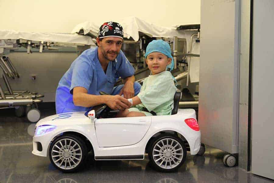
And this is the best example for me of informed empathy that accepts other people’s truth and experience. THIS is what happens when you put the human beings that you’re designing for at the centre of your process.
It’s a wonderful little tale of love: the hospital Zorrotzaurre in Bilbao, Spain Opens in new window substituted scary gurneys with toy cars for kids to be taken to the operating theatre.
Simply by truly empathising with their patients, these surgeons transformed the children’s experience into something fun instead of terrifying, that brought serenity instead of fear, and that created trust instead of dread.
It’s 100 out of 10 of course, in all 3 criteria – look, feel and usability. It looks and feels great, and it is also functional and easy to use.
The best empathy is informed as well as accepting that other people’s truth is as valid as yours, even though our personal experience is different.
This is a great lesson in empathy, and really the level of empathy we should always strive for.
How to assess good user experience design
But when it comes to the products* we create for our clients, how do we measure empathy? How do we tell if we’ve done a good job when we were creating our user experience design?
Let’s reverse-engineer the look, feel and usability criteria and look at a way of assessing empathic UXD via 3 simple questions.
- Does the product* give the user value?
- Does the user find the product simple to use and navigate?
- Does the user actually enjoy using the product?
(this came from a course I saw on the Interaction Design Foundation Opens in new window website.
Let’s find out via real-life examples.
*when we create digital applications, whether apps or websites or anything else, we’re actually creating products. That’s the term I’ll be using throughout this article.
User experience design in real-world products
This is the language learning website Duolingo Opens in new window.

The homepage gives an incredibly clear experience with a brilliantly simple <heading 1> that leaves us no doubt as to what we’ll get from our experience here. The written message is also supported by the simple but evocative imagery.
The user is literally led by the hand after taking the first call to action.

Before you know it, you find yourself actually learning a language without even having to set up a profile.

The designers put themselves in the position of the visitor whose burning desire is to learn a new language without spending a lot of money, and they made their journey incredibly easy.
So the 3 answers to the assessment questions are definitely YES:
- Yes it gives me value as a user, because I’m offered to learn in exchange of nothing, not even an email address;
- Yes, I find it simple to use and navigate;
- and yes, I really I enjoy it.
In the case of another language-learning software, Rosetta Stone Opens in new window, instead, the experience is nowhere near as smooth.

First of all, the homepage may make it clear that you can learn a language here, but the images are very generic and the copy is confusing – what do you mean, not just the words? I have to think to work out what they mean (and you know how rule number 1 is – don’t make me think Opens in new window).
In the second place, it’s impossible to get a demo without providing an email address. (With Duolingo I got learning straight away – I didn’t even need a demo).

so the 1st answer is a
- no, it gives me little value as a user;
the second answer, whether the site is difficult to use, is
- meh, because it’s not particularly difficult, unless you consider as the benchmark for that how easy it is to get a demo, and in that case it is a no; when I try a different journey to get to the demo, hoping it might be online and interactive like the previous one, I am actually asked to give them money already, without having even tried.

- as a consequence the third answer, whether I enjoy to use it, is a definite no. Which is a real shame, because their learning app is actually fun to use and gets you results.
I don’t care how good the Rosetta Stone language learning software is (and, like I said above, it is really good – I’ve bought it or subscribed to it for a number of languages many times in the past, before other softwares came onto the scene. It saved me when in China on a project in 2006).
I’m going back to Duolingo because it gives me much more value, I enjoy it so much more and it’s much easier to use. Duolingo makes me happy straight away.
In short: make your users happy.
Let’s see how we can achieve that.
How to get there: my version of the process
There is a design methodology called Design Thinking that can greatly help us with making our users as happy as I was when using the Duolingo site.
In fact, the UXD process and the Design Thinking process have a lot in common.
Simply put, they are both user-centric, which can be a big mentality shift to make for small business owners who make design decisions based on personal taste. We must make them change that attitude.
Because when you use Design Thinking, you make decisions based on what customers really need – not on the designer’s or the client’s preference.
And that’s what’s going to give you power: knowing that your decisions as well as the solutions you offer your clients are always backed up by solid reasons: never taste.
Let’s see what I mean by looking at a real-life situation that happened to me: a prospect came and said ‘we need to improve our web traffic this month by a third’. And they wanted to do this by buying Google and Facebook ads.
The astonishing power of annoying people by asking WHY too often.
The Design Thinking and the UX approach to this problem is to ask ‘why?, instead.
And you need to ask why as many times as necessary to unearth the true reason. Even when asking ‘why’ once again actually makes you a bit uncomfortable.
In the case of my client, the final answer to the question WHY do you need an increase in traffic? was that they were not getting as many sales as usual.
So the next question is ‘why aren’t the current users converting’? as a starting point, and the solution is definitely NOT Google ads.
In fact, I found out from the analytics that the website got a decent number of visitors, but there was absolutely nothing for them to do on the website or to come back for. The contact forms were completely buried. The homepage didn’t even explain what the website was actually selling.

So the need wasn’t traffic, it was on-page optimisation. Without the initial ‘why?’ question, it would have been easy to just do what the client asked and get them to waste money on Google or Facebook ads.
I ran a short survey with some of the existing clients which confirmed the initial analysis – there was just nothing for them to do once they got to the website, and finding the contact form took hard work.
You need to ask why as many times as necessary to unearth the true reason. Even when asking ‘why’ once again actually makes you a bit uncomfortable.
So by putting the WHY question first and then also asking the users, I got to the real problem.
And this is what Design Thinking is all about.
The short-term solution
A short-term, very quick solution without a re-design was to first of all change the headline and explain what the business was, adding an immediately visible ‘find out more’ button, a testimonial for credibility and social sharing buttons.

This didn’t mean there was anything to convert to yet, or that the photo involved the users emotionally in any way, but the experience of the users was immediately improved, because we put them at the centre. This made things better for the time being, although I knew that much more thinking would be needed for the long term.
A fairly typical situation for many of us.
This is, however, a fairly typical situation for a lot of us: a small business client with an old website that needs a lot of work, who has never really thought of asking their audience what they really want, or even used their website as a marketing tool.
And using a version of the Design Thinking process to help them find a solution can prove very effective as well as provide answers to problems they hadn’t even identified yet.
The phases of the Design Thinking process.
The Design Thinking process is built of 5 phases.
- First you empathise with your users,
- which is instrumental in defining the problem.
- Then you ideate the solution,
- you prototype it,
- and you test it.
Sometimes you’ll need to go from the prototype back to the idea or from the test back to the definition, from the test back to the idea and sometimes even all the way back from the testing to the empathy phase, that is to say the research.

So the process is not linear and it fully allows for the inevitable, messy going back and forth which is typical of design.
The Design Thinking process and the UXD process, in one (my version).
The UX process that I use simplifies these 5 phases into 3:
- research first,
- then the design phase,
- then the validation.

For me, research takes up 50% or even 60% of the time, while design and validation only take about 20% or 30% when the research is done properly.
This is also because the validation, that is to say the testing, is on-going and never quite stops: after you launch your product, it turns into what is called ‘optimisation’.
So it’s very much worth your while to invest in the research phase –without forgetting the testing, that is to say the validation.
And this is how the two processes are integrated:

The empathy and definition phases in the Design Thinking Process are fused into the research phase.
Ideation and prototype correspond to the design phase and then the testing is simply the validation, they’re just two different ways of calling the same thing.
Phase 1: Research
When you start researching your audience you need first of all to bear in mind that there are always 2 sides to an audience: the stakeholders on the business side and the users, that is to say the humans interacting with our products.
The essential part of the research phase (which, we must bear in mind, is the empathy phase) is to TALK to stakeholders and users, and ask them as many questions as possible, in order to find out as much as we can about the business and its market.
1a. Research on stakeholders
We can do that with interviews.
With the stakeholders, you can ask your questions via questionnaires to be filled separately, or during workshops for those clients who hate writing – and I know quite a few of those.
Usually when you start asking lots of questions you will unearth truths and issues about the business that will inform the design. It invariably happens.
People you should not miss out.
Usually the stakeholders in a business are the decision makers. But you need to make sure that you ask questions also to employees that may hold significant insights or that are going to use the website or app every day of their life. I’ve seen projects fail because of the employees not having been consulted.
The result of the research phase, once you have elaborated the answers, is that you are able to define the problem that the website must solve.
1b. Research on users
The other part of the research phase is of course the research on the users.
And here is where we may have a problem with a small business or a start-up, because it may be that they truly have no users yet or that they find it difficult to consult them.
There are simple ways around this.
First of all, in a small business, the business owner is usually also a user who created the business out of their own need or passion. An example is the boutique travel agency on the Camino de Santiago.
So first of all, ask them: the owners themselves. They are in a great position to help you create the ‘user personas’, identifying needs and requirements, also because the business has been running for a while so they’ve got to know their customers.
User personas are a distilled representation of the ideal human being that you want to serve with your products and services.
Another way is to use acquaintances and friends and run surveys, questionnaires and FB polls.
I identified potential aspiring Camino de Santiago pilgrims among my online acquaintances, friends and colleagues, and asked them loads of questions while getting them to use the existing website.
Also, you can find Facebook groups of target users and run polls or surveys. If you have the budget, you can run these with ads.
Or you can also get a bunch of users in a Zoom room (or any other conference call tool, even Skype will do) and run the questions as a workshop.
User personas are a distilled representation of the ideal human being that you want to serve with your products and services.
Once you have the user personas, you invariably get to the definition of their problem.
What you need to know in order to create user personas
This is what you need to know in order to create user personas:
- Demographics (the WHO): age, gender, occupation, income, geo location etc.
- Psychographics (the WHY): burning problem, emotions driving it, and desired successful outcome, which are often even more important;
- Needs: what do they need to solve their challenges and get to the desired outcome?
- Solutions: what will we provide in order to meet their needs?
- …and give them a name so that whatever you do for the business, you keep doing it with that person in mind.
It’s clear to see that when you create user personas you are using empathy while at the same time defining the problem. This simple process always has revealing moments that will shine a light on issues. Clients actually love doing this.
In the case of the boutique travel agency client, I built the ideal customer avatar for an upcoming long trip by interviewing the business owners and by asking a few questions to a handful of past clients who had been on that specific trip.
The WHY is what really drove the design. We already know in this case that my boutique travel agency client has the solution to all this. They have amazing reviews from all past clients.
The important thing is to make our customer avatar, Sharon, aware of the fact that we are the best travel agency for her.
So this brings us to the end of the research phase.
With all the information we’ve gathered from the business side interviews or workshops we can now devise a sitemap.
While the user interviews bring us to the definition of the user personas.
At the same time, we’ve also defined the needs and we can start thinking of the solution.
2. Phase 2: Design
Now we’ve moved into the design phase – although please note, very importantly, that in this phase design means planning, not styling – not yet.
We are in the problem solving phase, the style comes much later, in the UI phase, which comes after the UX phase.
A chicken and egg situation, i.e.: the real world is messy
And now I am going to contradict myself immediately.
I have just finished telling you that the UI phase comes after the UX phase.
And that is VERY true: however, it is mostly true in the case of a big project with a large budget and a large team.
In the case of the UX process for us, smaller people working on smaller projects with smaller budgets, the lines are much more blurred.
It is perfectly possible that you will build a styled prototype, or better said an actual website that you can launch rather than just wireframes, during the design, aka planning, phase of the UX process.
This does not detract anything from the process. Rather than meaning you are skipping a phase, it simply means you condense the phases.
It is sometimes simply more practical. It is also an approach that’s similar to the Growth-Driven Design methodology by HubSpot Opens in new window (see also below).
Back to the process
Back to the process, as I was saying: now we’ve moved in to the design phase, where we start planning out what needs to go in our website, app, or product, based on all the information we gathered in the research phase, that is to say, the solution.
In practical terms, this means that first of all, we’ll create the sitemap, using the information gathered in the research phase; then, we’ll create wireframes.
UX and UI working together
And here is a real-life demonstration of what I just said, about the UX and UI process getting mixed up in real life, when we deal with smaller projects.
The travel agency website mentioned above needed a rebuild, because it was built with obsolete as well as amateurish tools.
Note: there was budget for a rebuild, but not for a complete redesign. But while I rebuilt, I also re-jigged the design using all the information that I’d gathered.
However, while I absolutely did work on a new sitemap, I then jumped straight into the design, in-browser with a page builder, so straight in to the UI.
What really matters is that I did use what I learned to inform the design of the page.
I don’t have time today to describe this in detail, but let’s say at least that the copy is centred on Sharon, our avatar and the image also draws her in: it’s a beautifully evocative image taken on the Camino itself, and Sharon can imagine being in those woods, in that greenery, looking at her travelling companions from behind. The copy addresses her fears: she’s worried she might not be able to finish the camino, but we’re telling her that with us, everybody can do it. We also give her something to do with the big voucher button.

However, when Sharon first lands on the website we know that she’s often not ready to buy or even get a discount voucher, however big and bright we make that button. We need to reassure her further and we need to get her drawn in.
What’s the solution, I can hear you ask? Well of course, I answer you:
A funnel with a quiz.
No one can resist a quiz, and within the quiz we can use the copy to answer her questions and reassure her fears [make a note: copy is an essential part of UX].
We start from a map of this funnel, the first step towards clarifying how we would lead Sharon by the hand towards our final goal, which is simply the capture of her email address, because this company don’t actually sell online, they always create a personal relationship (that’s why they know their user personas so well).

You can see that even if a funnel is not quite a whole site, there are a number of pages that you need to build, and a sitemap is a huge help in clarifying all that’s needed, as I’m sure that you all probably already know.
The secret sauce is user flows
But the real secret, what makes ALL the difference, is really user flows.
To me, this was a new concept as a designer for print moved to the web. The journey that a user takes from the moment they get in touch with your product was not something I’d ever considered.
Whereas on the web, charting, predicting and directing the journey that your user will take and making it as smooth as possible is pretty much essential, as well as making our job as designers so much easier.
Building user flows, even more than building wireframes, cuts down design time by half, if not more, for me. And you can only really build a user flow if you put yourself firmly into the users’ shoes and walk with them.
I’m firmly in Sharon’s hiking boots right now.

When creating this flow, I stopped to consider questions such as:
- where is the user coming from? (in this case: FB ads, which already qualifies them)
- what happens if they’re not ready to take the quiz?
- and what if they do take the quiz, but don’t want the download?
- and so on.
Doing this helps hugely to consider things such as the fact that not everyone may be ready to take a certain action, for instance.
And once you do that, if you visualise the various actions (or lack thereof) as a flow in this way, it’s really easy to plan out the next moves and what should happen.
We captured a lot of people who wanted a discount with this, because we considered those who may be curious, but not enough to finish the quiz.
Wireframes and prototypes
Once you have the sitemap and the user flow established, you can move on to prototype the individual pages using wireframes.

The main reason for wireframes is that you establish the layout and the visual flow of crucial elements without the distraction of styling.
You want the honest truth? I don’t always use them. It really depends on the project, and the budget.
If you have to hand off the project to a developer, yes you do need them.
But in the messy reality of a small project for a small client, you often skip the prototype and you test on a real version of the website or app or funnel.
The travel agency quiz funnel
Speaking of which, back to our funnel, I’m thinking like Sharon, so this is what the landing page for the quiz looks like.

It asks the right questions and it has a photo that Sharon can identify with and be reassured by, and that stirs up the right emotions. It’s almost impossible not to feel a positive emotion when looking at this photo, and not to think, I want to be there too, and feel reassured that we can make it.
Then the quiz itself addresses all of Sharon’s fears and questions: copy is an essential part of UX, and this is a good example of that.

The quiz ends offering a free list of what to pack on the Camino that Sharon will definitely find useful. We’ve arrived to this conclusion by asking questions in relevant Facebook groups and sending survey emails to past clients.
Phase 3: Validation
However, until we test the product and use the data to optimise it, we won’t actually know whether this solution works perfectly: the optimisation is where we get the chance to improve it. And that’s what we do in phase 3: validation, aka testing.
When you do testing after launching, which is what we did with the funnel, you can already call it ‘optimising’, because you’re looking at improving your results via real usage data.
At any rate, usability testing is essential and it needs to be done at some point. And it can also be done on a budget.
Usability testing on a shoestring and on deadline
If you’re asking yourself, ‘how on earth can I run usability tests if I don’t have a budget’, this is how:
- Guerrilla: enter a cafe and ask strangers.
- Literally your partner or your kids or you parents
- Your colleagues who haven’t worked on the project
- Your friends, their parents, their kids
- Facebook groups
In the Camino de Santiago agency case, I used colleagues who were 100% the user persona or her husband, as well as friends’ parents who were also the older end of the demographics. These are the other methods you can use, and they all work.
The important thing is to make sure that you ask someone who has never seen your product before to use it. You will most likely suffer from what is called ‘proximity blindness’: and you will run the risk of missing out on important details.
Ask questions like:
- Do you understand what the product is for?
- Do you understand what it is selling/ talking about?
- What is it asking you to do?
- And so on.
Here’s a list of a few online tools you can use which are, if not free, at least affordable. And don’t think that you need huge samples, in the thousands: issues to be addressed can come up out of 5 tests.
If you want to find out more, you can buy the short but perfectly formed UX Made Easy Mini Course.
Pickfu Opens in new window– start poll in seconds, very affordably.
Userlytics Opens in new window – affordable insights from real-world user personas.
PixelSniffer Opens in new window – UI usability test. A good start but not always 100% reliable: use your own judgement.
UserBrain Opens in new window – videos of real people interacting with your product, affordably.
In conclusion: Style. Deploy. Optimise.
The whole, huge point about UX is that it is NOT a solution that’s perfect straight out of the box.
The WHOLE point is precisely the optimisation phase.That’s why methodologies such as Agile Opens in new window or Lean Opens in new window work well with UX: deploy quickly and then go back and optimise.
Make sure that your clients are aware of this and that they don’t expect amazing results straight out of the box. You get a solution out, then look at the data, go back and make it better.
Remember what we said about the design thinking process? It’s non-linear and the testing/ optimising phase is what you always get back to.
Another great methodology that’s excellent for user experience design is the ‘Growth-Driven Design’ methodology by HubSpot. Opens in new window
The concept is simple: instead of quoting for a huge design project that would take years to complete, start from a much smaller project and build on it every month, basing the growth on real-world data. It absolutely works for me.
Have you heard about the recent Accenture vs. Hertz debacle Opens in new window? That’s the kind of disaster that a growth-driven design approach would help you avoid.
In short – Beckett had it:
Try again.
Fail again.
Fail better.
