I’m a big fan of audits. Why? Because they’re the first, essential piece of research when you start working with a client. Also, because they often reveal there is no need to reinvent the wheel: you can almost always identify a few quick wins that will nevertheless be transformational, and improve conversions on a sluggish landing page – sometimes instantly!
How do I know? Because I’ve audited 100+ sites, apps, products and dashboards over the past 4+ years (probably a conservative estimate.) And 90% of them make the same mistakes that prevent conversions. The good news? They’re all preventable, and solvable mistakes.
13 tips to improve conversions
I have kept a record of the most frequent, conversion-preventing mistakes. They also reflect the journey I take when I conduct an audiA ct, even the quick Mini audit. I have counted 13 repeating patterns: here they are, together with the tips to correct them and improve those conversions.
1. A clear main heading
This is the first thing I look at, when I start an audit. You need to use your main heading (H1) to explain clearly to the visitor why they are here, and what they can get from you.
And yet, the vast majority of businesses get this wrong.
Why? I think it’s because it can be overwhelmingly difficult to extract your main offer in a few words only. Especially when the business is your own baby and you are so close to it, it’s difficult to see clearly (I call this “proximity blindness, and it’s one of the main reasons my audits are so useful).
How can you solve it? Hire a good UX writer who can help you with content design and copywriting. Honestly: money well spent. Trust me. It can make the difference between zero sales, and 1000s sales.
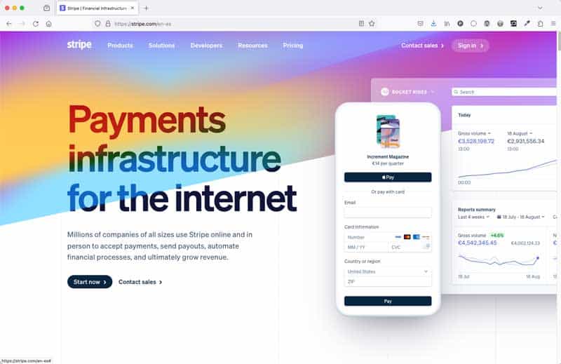
Example: Stripe
The main heading on the Stripe homepage Opens in new window (as of 29 January 2024) states very clearly what the business offers: Payments infrastructure for the internet. Simple, and straight to the point. That’s the power of research, and of a sound investment in good copywriting: definitely one of the best ways to improve conversions.
(You don’t need Stripe’s budget to improve your copywriting, by the way. I did it for wildcloud and they were very happy about it. Let’s talk Opens in new window if you need advice)
2. A clear sub paragraph
Even the clearest main heading needs a little bit of help: that’s what your sub paragraph’s job is, and that’s the second thing I look at when I carry out an audit. The 3 or 4 lines below your H1 on your homepage have the function of clarifying and expanding a little bit, so that the potential customer can work out whether they need your services and products or not.
Example: Stripe’s sub heading
Below the main heading “Payments infrastructure for the internet”, the Stripe homepage helpfully explains:
Millions of companies of all sizes use Stripe online and in person to accept payments, send payouts, automate financial processes, and ultimately grow revenue.
That’s even clearer now! So what do we need next? That’s easy: rally the troops to action, in the first step towards conversion.
3. A clear call to action
Always have a clear call to action underneath your main heading: give your visitor something to do, take them by the hand towards their next step. Once more, this would seem an obvious way to lead and improve conversions: and yet, so many of the websites I audit neglect this crucial step.
You’ve got to give your visitors something to do. Why would you leave them stranded, when you’ve got the opportunity to take them where you want them?
To that sweet spot where the needs of the clients and those of the business happily intersect.
Example: Stripe’s CTA
Stripe has chosen to have 2 calls to action: a button saying “Start now”, and a link saying “Contact sales”. I think it’s absolutely fine to have 2 calls to action when the situation requires it, and this is the case.
The hierarchy of needs is clearly stated: the “Start now” button gets the star treatment, while the “Contact sales” link is much more subdued.
My gripe with this is that the “Contact sales” link is not underlined, and therefore doesn’t look like a link. You know you need to underline your links Opens in new window, don’t you? Also, the type is a bit small, but it does magnify nicely.
4. A clear user journey
Now that you’ve given your human visitors something to do that will help them out, you must always check that the user journey makes sense and doesn’t lead to a blind alley. Once again, you’d think this would be a given: and yet, so often I encounter calls to action that lead the visitor up the garden path and back again, in a frustrating loop or worse. Want to improve your conversions? Create decent user flows, please.
Example: Stripe’s user journey
In our Stripe example, both calls to action take to pages that comply with what the microcopy promises: I can get started very easily if I follow the “Start now” button, and I can get in touch just as quickly if I click on the “contact sales” link (despite the fact that it’s not underlined).
So far, so good: conversion guaranteed, if the customer is ready to take action. Great example of a no-fluff, action-taking user flow, with the microcopy doing its job very well. Nothing more annoying than a button or link that promises something, only to deliver something else.
Note that here we are only concerning ourselves with the very beginning of this user journey, a bit like I would do in the Mini Audit. The full journey would be much longer, and include an email sequence as well as other touch points with the potential customer. (I look into all this when I carry out a Midi or Maxi Audit).
5: A clear semantic structure for your content
This one’s a biggy: you really need to use the correct heading structure to organise your content.
This will help screen readers and keyboard users, and it’s also great for SEO. Something else that I hardly ever see done! And yet it’s such a basic tenet of good web design.
Correct heading structure Opens in new window and layouts created using semantic HTML Opens in new window are essential for assistive technology users. For example, screen readers use headings to navigate the content structure. They allow users to quickly understand the hierarchy and context of the page, jumping from one section to another efficiently. This structured navigation is vital for those who rely on auditory feedback instead of visual cues.
However, this is one of those typical cases that demonstrate that while accessibility is essential for some, it is also so very useful for all.
Train your developers, designers, content creators to organise the content in a logical way. I promise you that the quality of the copywriting and code base will improve, too. Think of the expanded audience, improved conversions, SEO juice, enhanced speed, cleaner code… I could carry on.
Example: Stripe’s HTML structure
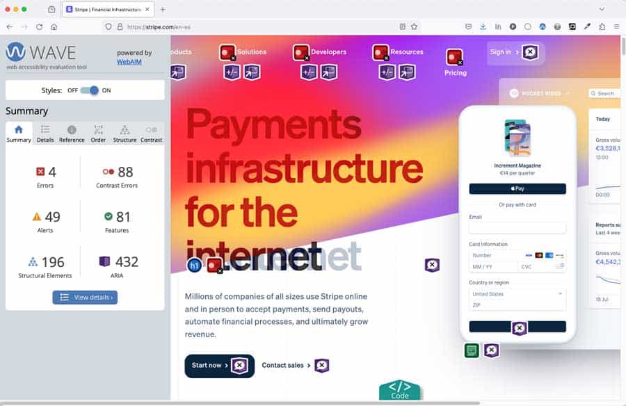
Quite surprisingly for a website and company so focused on conversions, the HTML structure on the Stripe site is appalling!!! Everything and by everything I mean as many as 73 headings are a H1 – when best practice states that you should only have 1 unique H1 per page Opens in new window, telling you what the main topic of the page is.
This page, while navigable by keyboard, would be a mess for a screen reader. How can you decide what is important, if everything is important?
It also has other semantic mistakes, such as 4 or 5 Navigation elements, and more.
Please don’t be like Stripe. Expand your audience and increase your conversions by using your headings and your HTML correctly and accessibly.

6: A clear and consistent approach to copy and microcopy
Don’t be creative with your copy: be clear. Cryptic humour, clever puns, inside jokes are not accessible – and they don’t convert. Accessibility starts from language. Not for the first time in this same article, I am going to tell you that if you want to improve your conversions you should invest in a good UX writer.
In the same vein, please keep your micro copy consistent: buttons that lead to a certain action should always have the same message. If “Book a call” leads to a calendar link, don’t change the copy to “Let’s talk” on another button leading to the same place.
Inconsistency of copy is another extremely frequent mistake I encounter when I conduct an audit, and it never fails to surprise me because your copy is the most important part of your site, probably making up about 90% of your content at least: why wouldn’t you invest in getting it right? But now you know, and I know you will.
Example: Stripe’s copy and micro copy
We’ve already seen how Stripe does this very well: they know that investing in copy has a great return on investment. Shame they haven’t quite grasped the same concept as regards accessibility, though.
7: Correct text and colour contrast
This is another one that you’ve heard before from me, a million times! Check your colour contrast: 83.6% of the top 1 million sites on the net in 2023 still didn’t do this Opens in new window. It boggles the mind, because it’s such an easy mistake to correct.
But fear not! There is help at hand. Here’s an article that tells you how to easily tweak colours in order to make the text legible.
Example: Stripe’s contrast
Shock horror! Stripe’s homepage has as many as 88 contrast errors 😱
Seriously! Please just don’t. But it’s clear to see (pun unintended) how the cute and trendy changing gradient often results in unreadable text, especially in areas such as the menu where the navigation links are in particularly small white type.
Also bear in mind that the WebAIM Web Accessibility Evaluation Tool Opens in new window I am using on this page only really picks up on about 30% of actual accessibility mistakes.
Please do not put style before accessibility: get your contrast right. Thank you.
8: Accessible typography
Another one that you’ve heard from me before: typeset your copy for accessibility. It’s a long story, and I can’t tell it all here. However, you could start it by picking an accessible typeface, and by avoiding all caps, title case, centred text: these will make your content very hard to read for many people, and your layout will look messy.
Good typography is inclusive Opens in new window ! And as such, it improves conversions, because it opens up your audience by an estimated 25%.
As said before when talking about copy: text is at least 90% of your content (yes, even when you use video a lot), so you need to get it right. There is a lot to say about accessible typography, and say it I will, very soon. In the meantime, this article gives you good typography tips for you to get started.
Example: Stripe’s typography
If it weren’t for the blasted contrast issues (both with colour and size), and for the woeful use of headings, Stripe’s typography would be great, visually. The font is not, strictly speaking, totally accessible (the uppercase “I” and the lowercase “l” look pretty much the same, for instance. But that’s a longer story that I will tell you some day).
However, the way the type is set visually is beautiful, with no centred text in sight: what a shame that no two hoots are given to semantic HTML. As said above, the heading in this image is one of 73 Heading level 1s on the page! It must be a record (I honestly hope nobody tries to go above 73).

9: Avoid pointless illustrations
I am aware that this is an unpopular opinion, and yet I firmly stand behind it. Of course, great images that tell a story help improve conversions. However, I see this extremely rarely, especially in websites in the tech sector.
If you don’t have the budget for proper visual storytelling, I beg you to refrain from hitting the stock libraries for the usual tech vectors. Opens in new window
Yes, I firmly believe that no image is better than visual clutter. You know those vector illustrations with people using a computer or touch screens that every tech website seems compelled to use?
Those are pointless illustrations that add nothing to the story. Research proves that most people will simply ignore them. Trust me: it is possible to build a visually engaging site using (almost) just typography done right.
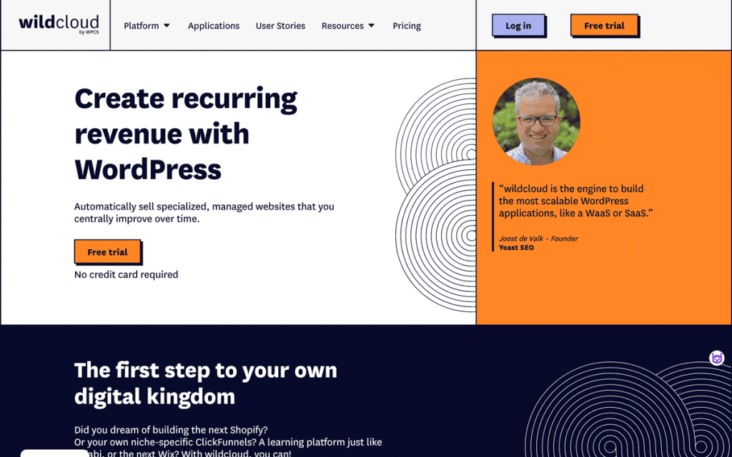
Example: the new wildcloud site
When Sybren van Kesteren Opens in new window and Roger Rosweide Opens in new window from wildcloud Opens in new window asked me to help them re-design the UX and UI of their company’s website after I conducted an in-depth audit of their original site, they were adamant I should include the dreaded vector illustrations that every single other WordPress plugin uses on their homepage.
I asked them to let me try something else. Luckily, it worked: they listened, and they loved the result. I created a super simple graphic in Figma: a version of an infinite symbol made of concentric circular shapes, that could be used in the background as a repeating pattern. That’s it. That was all: that, and a Mondrian-like grid using the brand colours (tweaked to be accessible), and typography.
The symbol works conceptually, because wildcloud (formerly known as WPCS) is like multisite, but better: you can use it to spin up a virtually infinite number of WordPress applications on it.
So you see? Better no illustration, than pointless illustrations. Good design doesn’t need generic vectors to look great (tip: a tight grid helps a lot).
10: No text on images
Do not place your text on top of a busy image. This communicates indecision, as well as being difficult to read. Do you want me to read the copy, or look at your image? When you place text on your busy photograph, I can do neither. So if you want to improve your conversions, keep text and images separate.
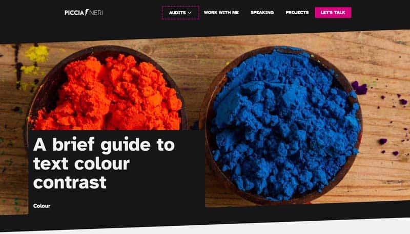
Example: the header of the articles on this website
I want you to be able to read the title of this piece, while the image is largely irrelevant, it’s only there to bring a little light relief. So the title is set in almost white type, and placed in an almost black box, sitting on top of the image, but still perfectly legible. Simple! I like the photo, I took it myself, but for me it’s much more important that you can read the text.
11: No sliders. Seriously
Do not use a slider.
It’s 2024 and I still have to say this, so I’ll repeat it: do not use a slider.
Sliders are almost always inaccessible, they slow your site down, and they communicate indecision: make up your mind about one message, and not more. Nobody cares about your slider less than your customers.
And those who are forced to care are those that find it impossible to get on your website and buy your stuff Opens in new window, because of your blessed slider.
12: No autoplay media
You know what’s as fun as being trapped in a washing machine’s fastest spin cycle Opens in new window ?
Being forced to watch unstoppable GIFs and reckless animations.
Yep: your GIFs, your animations, your autoplay background videos are literally making billions of people sick. For those with a vestibular disorder, being forced to watch a disorienting moving image is as fun as a whisky hangover, or food poisoning. Not to mention the effect it can have for those on the autistic spectrum, or with a vision disability, or with dyslexia, or epilepsy.
Does it mean you can never use animations again? Of course you can!
Just long as you:
- Follow the “Pause, Stop, Hide” WCAG guideline
- Set it to not contain either blinking or flashing
- Set Alt Text/ captions wherever possible
- Never set a video to autoplay
- Are absolutely sure you can’t use a still image instead
Dizzy users close browsers! Keeping their stomachs happy will be sure to increase your conversions. I am so sure of it, that I created a whole talk around my mission to stop reckless movement on the web.
Example: the Stripe website Opens in new window
As you scroll down, the homepage is absolutely choke-a-block with GIFs I can’t stop. I can’t peruse that site without feeling seasick. It’s a good job that Stripe deal with the important information in the top bit, or I’d never have set it up on my websites.
13: Captions and transcriptions
One more for the very long series “Accessibility is essential for some, and brilliant for all”: all videos must be captioned and transcribed. Yep, even a 1-minute testimonial. This is not a tall order, by the way: it’s a Level A WCAG requirement, that is to say the lowest level.
You can easily do that with a tool like Otter, which learns your quirks and pronunciation, and will soon output near-perfect transcripts from your videos. Or you can just upload to Vimeo or YouTube, and let their brilliant AI caption – although editing is recommended.
As for the transcript, both YT and Vimeo have it as an in-built feature. However, if you publish an edited transcript of your videos on your website, you know what you get? Yes: SEO juice. Which equals more traffic, which often equals – you’ve guessed it – improved conversions.
Recapping:
1. A clear main heading
2. A clear sub paragraph
3. A clear call to action
4. A clear user journey
5. A clear semantic structure for your content
6. A clear and consistent approach to copy and microcopy
7. Correct text and colour contrast
8. Accessible typography
9. Avoid pointless illustrations
10. 10: No text on images
11. No sliders. Seriously
12. No autoplay media
13. Captions and transcriptions
Notice a pattern?
If not, I’ll tell you: every single one of these tips to improve your conversions is, in fact, an accessibility tip.
Accessibility improves conversions: it’s a fact. And it also improves usability, inclusivity, SEO, and overall user experience.
Overwhelmed? Don’t be. It’s so easy to implement all of these tips as part of your workflow. And after you’ve done it once, it will become natural to keep maintaining the good habits – especially when you have to admit that your conversions have improved.
But if you want advice, let’s talk! Book a free intro call with me, and let’s see how we can start increasing those conversions straight away.
