Note from the future: if you’ve seen my talks on colour recently (we are now in 2024), you’ll have heard me say that colour harmony is pointless and you should not rely on colour to really express your brand. I kind of mean that! I’ve changed my way of thinking since writing this article: accessibility comes first for me now. However, it’s a very good, very informative piece on colour harmony and such, still valid. Want to see me talk on colour in a different way? Check out Colour is an Opinion Opens in new window at WC Asia 2023 in Bangkok
In this 4th post in the colour series, you’ll learn how to use colour harmony to confidently create bold, effective colour schemes that will even more dramatically improve the impact and effectiveness of your designs (we love a bit of colour drama).
Understanding colour harmony will make you able to choose the colour palette for your brand, website or any other design in full confidence, knowing how to use colour to make your content stand out, your communication clearer, your brand message stronger.
Colour harmony with the colour wheel
‘Harmony’ as a general term is the balance between different elements, and it sits in between monotony and chaos.
When processing information, the eye rejects under-stimulating information as well as lack of organisation: the goal is to achieve a visual unity that keeps the interest alive.
This balance between too much unity and too little organisation is called ‘harmony’.
In our case, colour harmony is the art of creating balanced, pleasing arrangements of colours that suit our message, our designs and environments.
The basic techniques of colour harmony all start from the position of the colours on the wheel. Once you select your base colours, you can find the ones that will work with them by using simple colour harmony rules.
With a good grasp of these simple techniques, you won’t have a problem picking the right palettes for your projects.
Colour harmony is the art of creating balanced, pleasing arrangements of colours that suit our message, our designs and environments.
Monochromatic colour harmony
Monochromatic colour harmonies are built using variations of the same hue.
As we have seen in the previous post in this series, a specific hue can be modified by using tones (hue+grey), shades (hue+black) and tints (hue+white). Select your base colour, then add white or grey or black to it: that’s your monochrome colour palette.
Design tips
PROS: This type of colour scheme is easy to build and it has less room for error than more complex colour combinations.
CONS: However, while it will definitely have unity, it may lack in visual interest: make sure you create enough contrast to keep the attention alive.
Example of a monochromatic colour palette

APPLICATION: Use the darkest shade as your text colour; the lightest, less saturated tint as your background; the second darkest shade for headings; and the brightest, most vivacious variation for graphic accents within your designs.
Use with designs that have a lot of colourful content, for instance an online shop.
Analogous colour harmony
Analogous colours sit next to one another on the colour wheel.

As these colours are a mix of one another, a colour harmony that is based on analogous colours is particularly pleasing and soothing to the eye.

Design tips
PROS: Analogous colour schemes are easy to build and quite difficult to get wrong. They are restful for the eye and naturally harmonious.
CONS: The possible problem with this type of palette, much as with monochromatic palettes, is an excess of visual unity.
This can be counterbalanced by applying variations to the hue’s attributes. Besides the pure hues, we can use tints, shades and tones to create contrast: the result will be a palette that is as harmonious as it is interesting.
WHEN TO USE: Analogous colour schemes are suitable when you don’t need much contrast, or you don’t want to make a big visual impact. They are suitable for sites or design projects with colourful content, although in this case a muted palette is more suitable than a vibrant one.
Example of analogous colour harmony

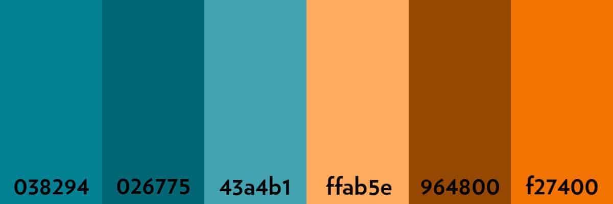
Complementary colours
Complementary colours sit opposite to one another on the colour wheel. Like most opposites, they attract.

Colour schemes based on complementary colours are bold, highly dynamic and have great impact – your design is bound to get noticed.

They are also more difficult to use for beginners: complementary colours, when sitting next to one another, can produce unpleasant optical effects.
Design tips
PROS: Complementary colour harmonies are great to express boldness, high action, dynamism. They require confidence and a firm design hand. Use them to stand out.
CONS: Be careful, however: avoid using a complementary colour scheme when your website or design project uses many colourful images that would clash with your colour scheme. This is a colour scheme to avoid also when the aim is to project calm, reliability, lack of tension.
Example of complementary colour palette
When the combination looks too strong, you can use shades, tints or tones of the colours to make it more muted and less aggressive.
APPLICATION: Use with designs that have monochrome content, for instance black and white photography or line drawings: a complementary palette would bring dynamism and vibrancy to the design.
Mix it with neutrals, or black and whites, for the details that need to stand out from the background. Make sure that you use tints and shades or tones to soften the contrast between opposite hues.
Use for young, vibrant brands and projects, when your aim is to convey a sense of liveliness, dynamism and edginess.

DON’T USE: Never use complementary colours directly next to one another for text colour schemes, the combination would be illegible.


An aside. A childhood memory: my complementary colours epiphany
One of the most vivid memories from my childhood is this. My sister and I were obsessed with weaving bracelets made of tiny beads, on looms that we made ourselves – basically just a plank of wood with nails on either end.
I remember buying this bright, electric blue beads, and putting them together in a design with vivid orange beads.
I will never forget the depth and energy of feeling that pervaded me just by looking at those two colours together.
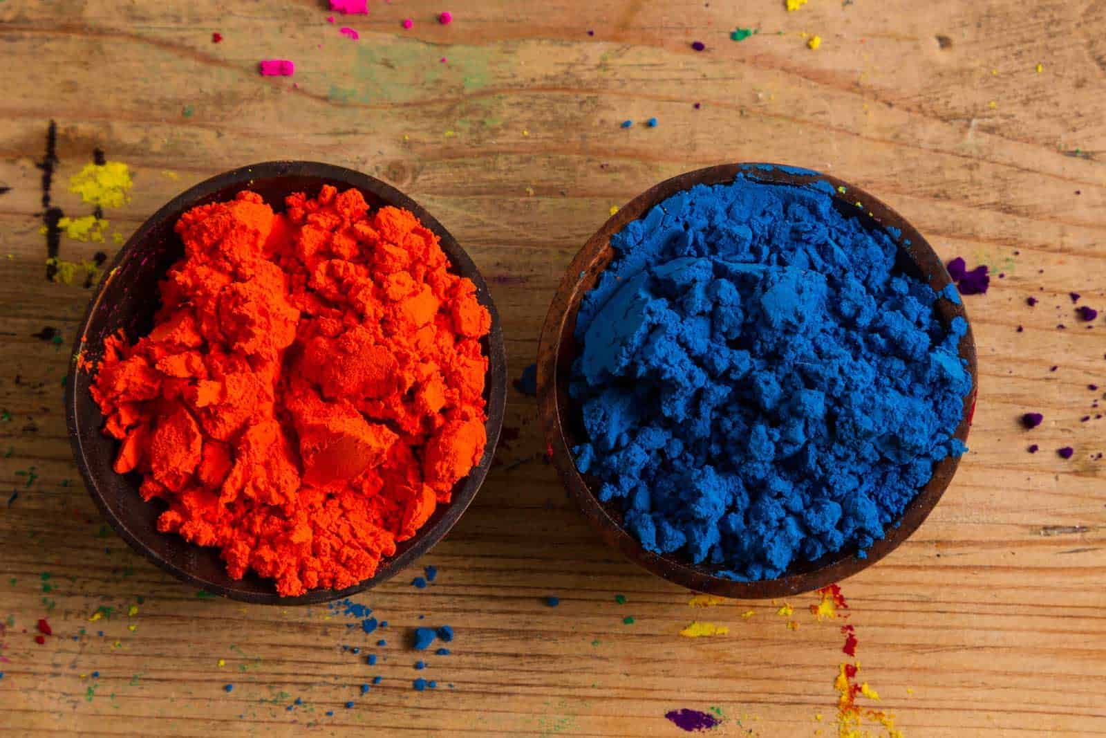
I do think that moment changed me, even though it took so much longer for me to realise that image-making and colours were my true vocation.
Now I know that orange and blue sit on opposite sides of wheel. They are complementary colours, and as such they have a special relationship. They are meant to be the opposite and the complement of each other.
Nobody had explained that to me at the time: I had just seen it, and it had owned me.
It had simply shown itself to me, the deeply contrasting beauty, the apparent clash that leads to harmony.
Electric blue and bright orange on a child’s bracelet brought on my world of colour epiphany. I can safely say, with only a tiny trace of hyperbolic irony, that my life was never quite the same again.
Triadic colour harmony
Triads of colours are formed by three colours that are evenly spaced on the colour wheel.

Triadic colour harmonies tend to be vibrant and impactful in a similar way to complementary colours.
Design tips
PROS: Triadic harmonies are beautiful and strong. A balanced, successful way of using a triadic harmony in a design is to choose a dominant colour and use the other two for accents. As we have learnt, a high contrast can be softened by using tints or shades in between contrasting hues.
CONS: Same advice as for complementary (and any other vivacious, bold colour harmony): avoid using triadic colour harmonies for design projects that will involve the use of very colourful imagery.
APPLICATION: Much like complementary colour palettes, triadic palettes are best used with content that is uniform in colour. Also, when you build your triadic colour system, use a much darker version of one of the colours, and a much paler one, to create neutrals in your palette.
Example of triadic colour palette

It’s possible to create triadic harmonies that exhude calm and tranquility, by using tints and shades and lowering the saturation: with full-chroma hues, the use should be reserved for young and vibrant concepts, as we saw for complementary colour palettes.

Split complementaries colour harmony
Colour harmonies formed by split complementaries use a base colour, and the two colours that sit on either side of its complementary.

Design tips
PROS: I love split complementary colour harmonies: they are as strong as complementaries, but with more subtlety. Use when you need to make an impact, but you don’t need to shout.
Example of triadic colour palette

CONS: Once again: avoid using this type of harmony in colourful designs.
APPLICATION: Split complementaries have a wide range of hues, so like we’ve seen with similarly varied palettes, you should use one main colour for your design with the other ones for accents, and a very dark and very pale version of one of the colours as neutrals.
Tetradic colour harmony
A tetradic colour harmony uses two pairs of complementary colours.
Their positions can form either a square or a triangle on the wheel.

As you can imagine, tetradic harmonies are not the easiest to pull off. You might also argue that 4 is too many colours. However, it’s possible to create balanced palettes if you pair colours that sit close to one another on the wheel.
Design tips
PROS: Tetradic colour palettes are full of life! They can, of course, also be muted if you use shades or take down the saturation. They can be very useful when you need to create a colour coding system.

CONS: Avoid with highly colourful content, obviously, as said above for similar schemes. Only for those who are totally sure they can handle colour with flair. Not for beginners. The wrong pairing can look truly awful.

APPLICATION:
Use sparingly, for projects that don’t have any colourful content, and when you need many strongly different hues to use as colour codes (for example: signage in a hospital, or an underground map that has 4 lines).

Of course, using shades or tones of these colours would change mood and application of this palette.
Conclusion
Now you have a basic understanding of colour harmony and why certain colours go together, while others don’t: you are able to create colour palettes simply starting from the colour wheel.
However, our journey into the world of colour is far from over: what you need to learn now is how to make your own life super-easy with the amazing tools that the internet puts to our disposal when we need to create colour schemes for our designs.
Note from the future: what you need to learn now is how to use colour accessibly! Check out this article on text colour contrast, and this other article on how to use colour accessibly in web design.
