Note from the future: I have changed my attitude to colour since first writing this article. Colour theory is outmoded and easy to debunk. However, the information in here is still valid and helpful, so please do read it.
When you approach a new design project of any kind, an essential element you need to consider and know how to use is colour.
In the 2 previous blog posts on colour we learnt what colour is and how we see it. We also found out when and how to use the RGB and CMYK colour systems as well as HSB colour, Lab colour and hexadecimal colour.
In this post, we will focus on understanding basic colour facts and using a design principle for a dramatic improvement in the impact of your designs.
Colour is an essential element in the design process.
This post covers these basic colour facts, and how to use them:
- The colour wheel
- Primary, Secondary and Tertiary colours
- Warm and cool colours
- Hue, Lightness, Saturation
- Tints, tones and shades
- Putting it into practice: the principle of contrast
The Colour Wheel
[If you need a detailed reminder of what colour is, please head off to the first post in this series.]
The best place to start examining colour and its attributes is the colour wheel.
The colour wheel is a circular diagram with a logically arranged sequence of colours.
The first scientist to come up with the concept of the colour wheel was Sir Isaac Newton in 1666. Many other iterations of the colour wheel have been produced since then. We have seen the Photoshop colour wheel in the previous blog posts in this series.
All that matters to us is right now is this:
The colour wheel is an essential tool to understand how colours are arranged, how they interact, how to choose colour combinations, and why.
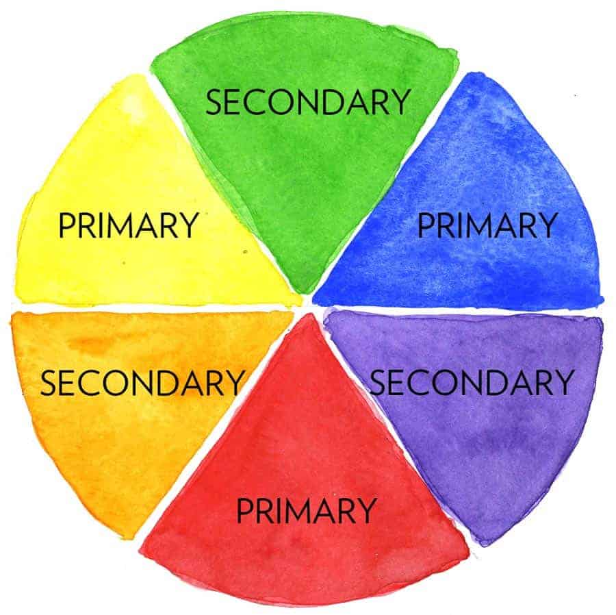
This 6-colour wheel contains the three primary colours, and the three secondary ones that are obtained by mixing the three primaries. It would already be enough to form many colour schemes, once you know how to use colour attributes and alter colour hues to create palettes.
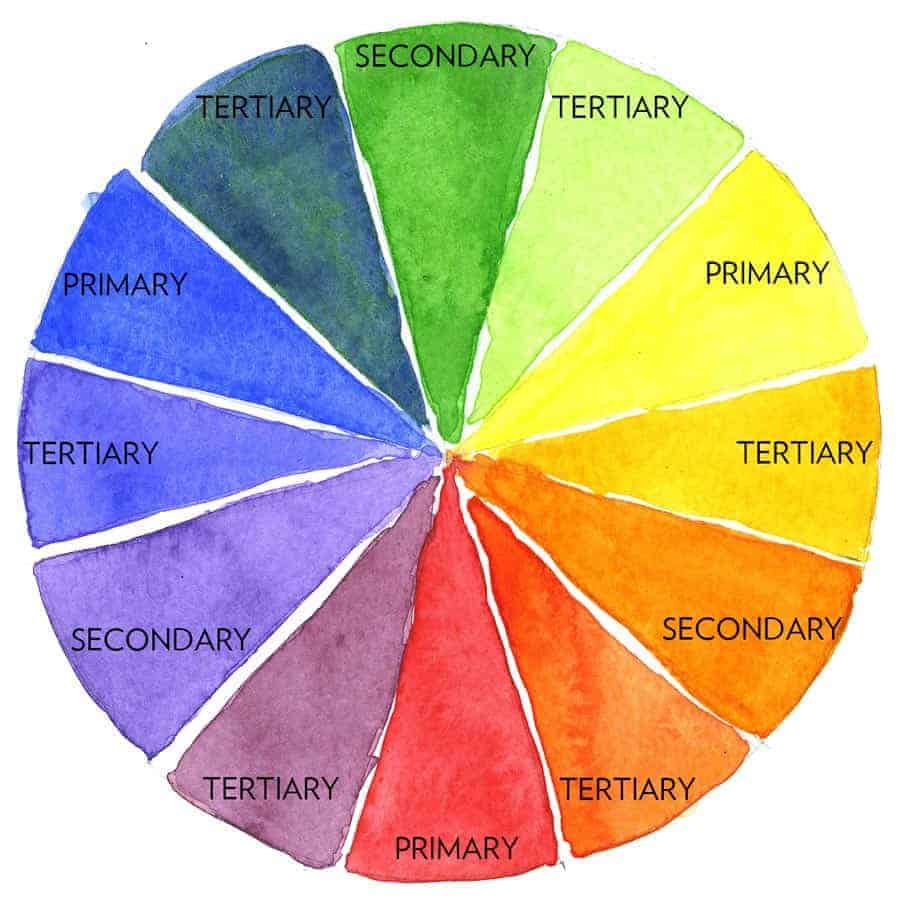
Primary, secondary and tertiary colours on the colour wheel.
We have seen how different colour systems have different primary colours. In colour theory, which is device-independent, the primary colours are red, yellow and blue (RYB).
Secondary colours are formed by mixing a primary with another primary: yellow and blue form green, red and yellow form orange and red and blue form purple. On the wheel, secondary colours sit in between the two colours that they are mixed from.
Tertiary colours are formed by mixing a primary colour with a secondary colour. On the wheel, they sit in between these two.
For instance, dark yellow is formed by mixing primary yellow with secondary orange: the resulting dark yellow is the tertiary colour and it sits in between the two colours it originates from on the wheel.
Warm and cool colours
A first, simple and very useful classification that the colour wheel allows us to formulate is the separation between warm and cool colours.
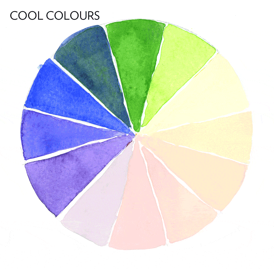
Blues, blue-greens and greens are cool colours. Purples sit on both sides. Yellows, oranges and reds are warm colours.
When considering what colours to pick for a design project, it can be a good idea to start from colour temperature.
Warm colours are conventionally perceived as active, friendly, energetic, exciting.
Cool colours are generally perceived as passive, calm, collected, reliable (think of how many IT or financial brands are blue, for instance).
Warm within cool, and cool within warm
Colours classified as warm, like red, can have cool hues when they have a high percentage of a cool hue in the mix. For instance, red has a range of hues going from very warm (yellow-based) to very cool (blue-based).

Colours classified as cool, like green, can also have warm hues, based on yellow, and cool hues, based on blue.
Design tip
This classification of warm and cool colours can provide a conceptual direction: is warmth the right choice of colour for your design? or would cool, aloof hues be a better fit?
Understanding this colour fact will help you make the first decisions in your choice of colours for your design.
Cool colours tend to recede.
Warm colours tend to jump out.
Basic colour attributes
The three basic colour attributes that you can manipulate to change the appearance of colour as well as its nuance of meaning are hue, brightness and saturation. You are probably already familiar with these essential terms, even from adjusting your TV or computer monitor.
Hue
The term hue refers to a specific colour, for instance red or yellow or blue. Simply put: hue is just another way to mean ‘colour’.


Brightness
The brightness attribute refers to the amount of light present in a colour, that is to say its level of lightness or darkness.

The degree of lightness and darkness in a colour can also be referred to as ‘value’. The darker end of a hue has a low value; the lighter end a high value.
Design tips
Understanding how to use value is important in graphic design: people with vision impairments often cannot see hues, but they do see differences in value.
Making a colour brighter or darker can also alter the mood of a colour scheme.
Saturation
The term saturation refers to the degree of intensity (also referred to as ‘purity’, or ‘ chroma’) of a colour.
Design tips
Changing the saturation of a colour (or of an image overall) usually results in a completely different message. Saturated colours are brilliant, lively and loud. Desaturated colours are dull, muted, much calmer.
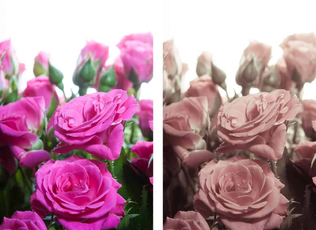
Time desaturates colour: a desatured image usually evokes a feeling of nostalgia.
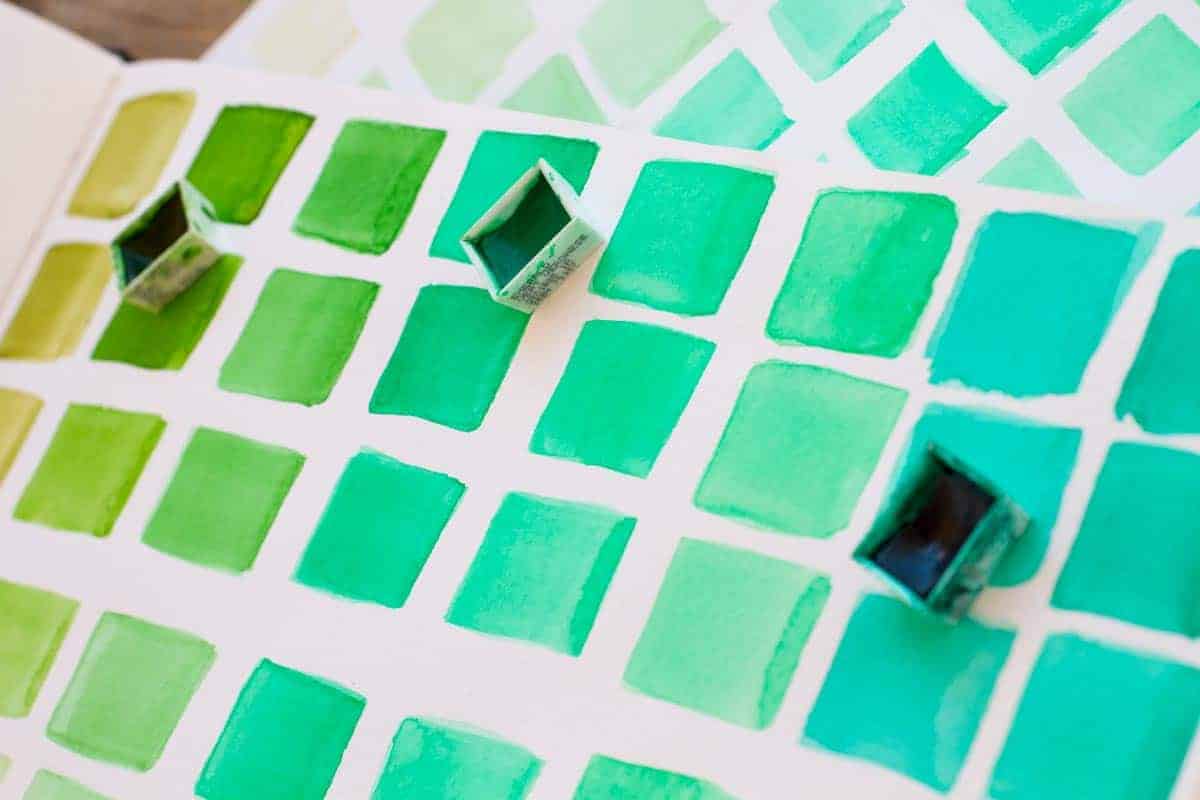
Tints, tones and shades
There are other ways in which each colour on the wheel can be manipulated to create variations that you can use in your designs.
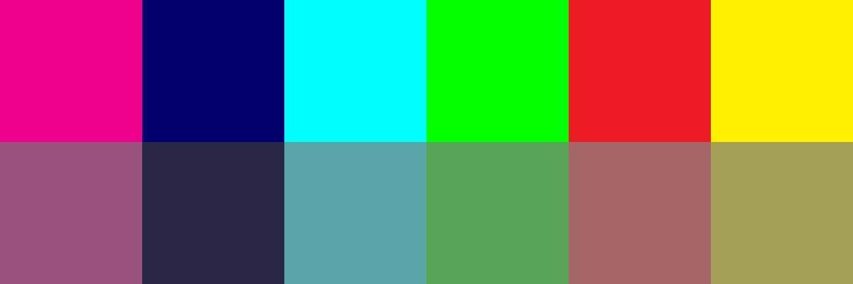
A TINT is a colour mixed with white.
A TONE is a colour mixed with grey.
A SHADE is a colour mixed with black.
Now you know that ‘a shade of green’ is a green that has black in it; you know that ‘a tonal scheme’ is a colour palette that uses the same colour with different gradations of grey in it; and that a ‘tint’ of a colour means a lighter version of that colour, mixed with white.
By the way, tints, tones and shades are also less saturated than the hue they’ve been mixed from, because they are less pure.
Design tips
You can create many variations of the same colour by using tints, shades and tones: you could build entire palettes starting from just one colour.

The one downside to this type of palette is that you might find yourself with a bit of a flat colour scheme: you may want to add a bit of drama to the recipe if you want to make sure that your elements stand out. For the “dramatic improvement” the title of this post promises: enter the design principle of contrast.
Putting it all into practice
It’s always good to see how theory provides the basis for good practice. The essential colour facts that we have learnt in this past enable us to start building simple, but effective, colour palettes based on the design principle of contrast.
Start using contrast with the simple colour techniques you have learnt in this post, and your designs and colour palettes will indeed see the dramatic improvement promised in the title of this post.
Contrast is attractive to the eye, it creates focus and it organises. It’s also bold, assertive, and effective even when used with subtlety.
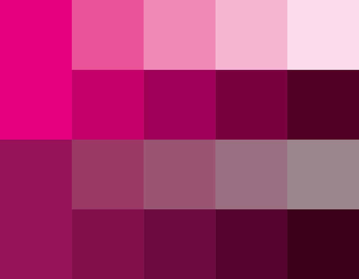
Create subtle but effective contrast by playing with the saturation of a hue:

You can also play with the contrast between a very low value (dark) hue and a very high value (light) hue, to create a palette with dramatic effect:
The contrast between a warm and a cool colour also provides an excellent starting point for a colour palette, and is often very impactful:

Conclusion
Well – that was a lot to take in.
In the next post, we will build on this knowledge and learn with practical examples how to use the colour wheel to create colour harmonies that are balanced, effective and meaningful.
Was this post useful? I’d love to know if you found it helpful, or what I should improve. Please let me know what you think in the comment box.
All images in this article © Piccia Neri. All rights reserved.
