What is RGB colour? What is CMYK? and what is the difference between RGB and CMYK? It’s essential to know this, if you need to work with images on the web and in print.
1. What is colour?
Before we even talk about colour systems, we must answer this question first: what is colour? It may seem like an obvious or even ridiculous question – but the truth is that 1. there is no such thing as a stupid question; 2. colour is, in my opinion, still one of the most misunderstood design elements.
And yet, understanding colour is essential to the success of our business: a product designer who suddenly has to get a leaflet printed for a fair or a conference, while they’ve never known the difference between RGB and CMYK, will certainly be happy to be informed.
Colour is light
It is essential to understand that colour is created by light. Without light, we cannot see colour. Simply put: colour is perceived by the eye as a result of the way an object emits or reflects light. Colour in itself doesn’t exist: it’s a human perception of wavelengths of electromagnetic energy that make up the visible spectrum of light. This perception also varies depending on a number of factors: physiology, psychology, culture.
This applies both to the colours that you see on a screen, and the colours of any reflective surface – in the first case the colour is emitted, in the second the colour is light reflected on the surface. Let’s have a look at how that works.
2. The RGB colour system
In the image below, you can see a visual representation of the RGB colour system, in which colour is created by light. The RGB acronym stands for Red, Green and Blue: the primary colours for the RGB system. When they overlap, they form white. This is why they are called additive colours: they are colours obtained by emitted light directly from a source, and when the three primaries overlap, the result is white light. RGB colour is made of LIGHT. Red, Green and Blue are LIGHT BEAMS.
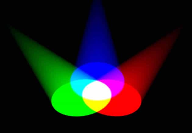
So, right off, this is the difference between RGB and CMYK. In the RGB colour system the colour is emitted directly, so it shines through. In the CMYK colour system, the light is bounced off the surface. It’s not transparent: it’s reflective.
Where is RGB used?
RGB is the colour system used on your computer screen and on your tv, on your telephone and tablet, at the cinema, on your camera. Any time it involves a digital platform – it’s RGB. Simple.
There are 256 colour levels (0 to 255) in the RGB colour system. Thanks to this, we can form other colours. This is what the RGB colour slider looks in Photoshop:

In this example, 0 red, 128 green and 120 blue give a teal green colour.
Below, you can see what happens when you have a full beam (255) for each of the primary colours: white is the result. It’s the linear representation of the three light beams overlapping that we saw at the beginning. The addition of the three primaries creates white – this is why the RGB colour system is called additive. That’s another difference between RGB and CMYK, as we will see in a minute.

On the other hand, zero red, zero blue and zero green produce black.
Black is nothing other than the absence of light.
Zero light = black.

So this is why, when you save for the web, you must make sure that your image is saved as RGB. This is the colour system that your screen, and your browser, and the internet, will understand.
The RGB colour system comprises a very wide range of colours (called gamut): if you multiply the levels of the 3 RGB values, 0 to 255, by one another, you get nearly 17 million colours:
256x256x256 equals 16,777,216.
Most top of the range modern monitors do reproduce the entire RGB gamut – for instance Apple monitors.
The CMYK colour system
Things are quite different in the real world, where most objects get their colour through a combination of reflection, absorption and scattering of the light that hits on them.
This is why the behaviour of colours changes entirely when you print things out.
The first reason is that, as we saw earlier, colours in the real world, outside of screens, are mostly produced by light bouncing off surfaces, not shining through them (unless it’s glass or other see-through surface of course).
The second reason is that in order to print colours you need to use coloured ink. The colours of these inks are: cyan (blue), magenta (a bright pink), yellow and key (black). This is what the CMYK acronym stands for: the 4 primary colours for printing. All colours in print are formed by mixing a percentage of these 4 colours.
The third reason is that the colour of the paper you use will also produce a variation in colour.
The CMYK colour system is called subtractive, because each of the colours when printed subtracts from white. Also, when these 4 colours overlap they form 100% black – so, the opposite of RGB, where the 3 colours overlapping forms white. And here’s the other difference between RGB and CMYK that I hinted at above.

The same teal colour we saw above, translated from RGB to CMYK:

You can see from this colour slider how you can mix colours in CMYK: 86% blue, 30% magenta, 55% yellow and 9% black give you the same teal green colour. It’s worth repeating, however, that the colour you see on your screen will not be the same when printed. Colour transferred from on-screen RGB to print CMYK changes considerably: don’t be disappointed when it does. Always ask your printer, or print a sample before.
It’s also best to use round numbers when you make up CMYK colours: always round up the percentage to the nearest 5% or 10%. So for that teal colour I would probably advise: C85, M30, y55, K10. Graphic designers often use big printed swatch books so they don’t get their colours wrong once they are printed – it would be a costly mistake. Much better to make sure they know what you are getting, before you go to print.

This is an enlarged example of how the CMYK printing process works: a photographic image is separated into the 4 primaries CMYK, in the form of small dots. This colour system is called subtractive, because each of the colours when printed subtracts from white. Also, when these 4 colours overlap they form 100% black – so, the opposite of RGB, where the 3 colours overlapping forms white.

Here is the same teal green colour we’ve looked at above, picked apart again in the colour picker in Photoshop.
Other colour systems
The Photoshop colour picker also shows you how the same colour is obtained in other colour systems: HSB, Lab, and hexadecimal. But that’s a whole other post! so stay tuned for that…
Did this article help you? Is the difference between the two main colour systems clear to you now? Please let me know if there is anything else you would like me to clarify for you.
And if you truly never want to get colour wrong again – then check out the other posts in the series and make sure you download the extremely useful 2x colour cheat sheets.
