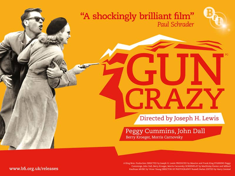
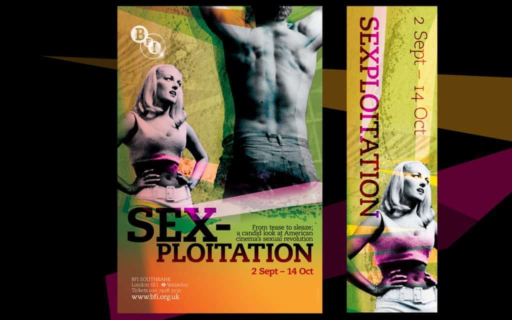
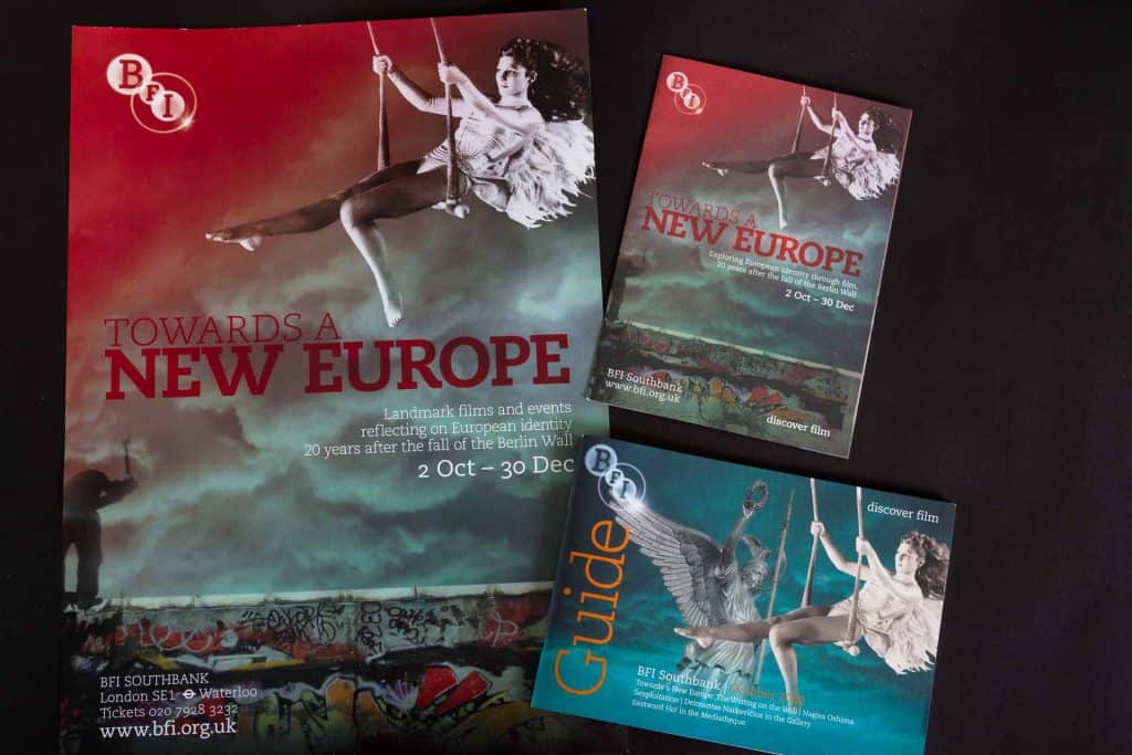
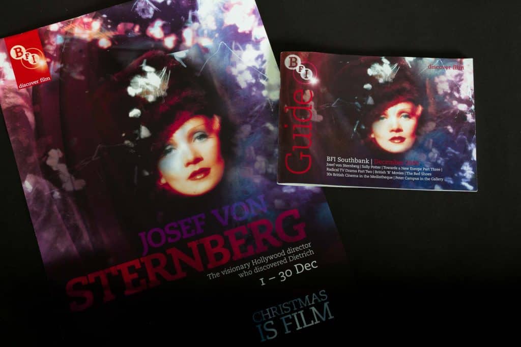
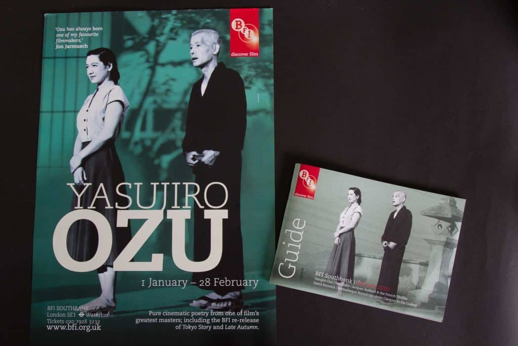
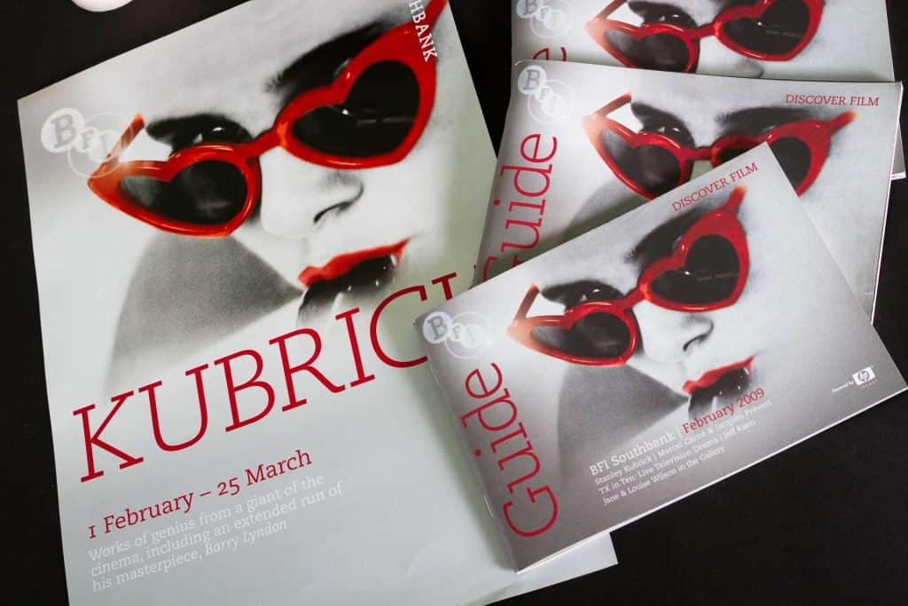
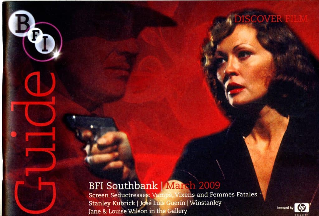
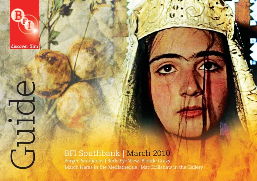
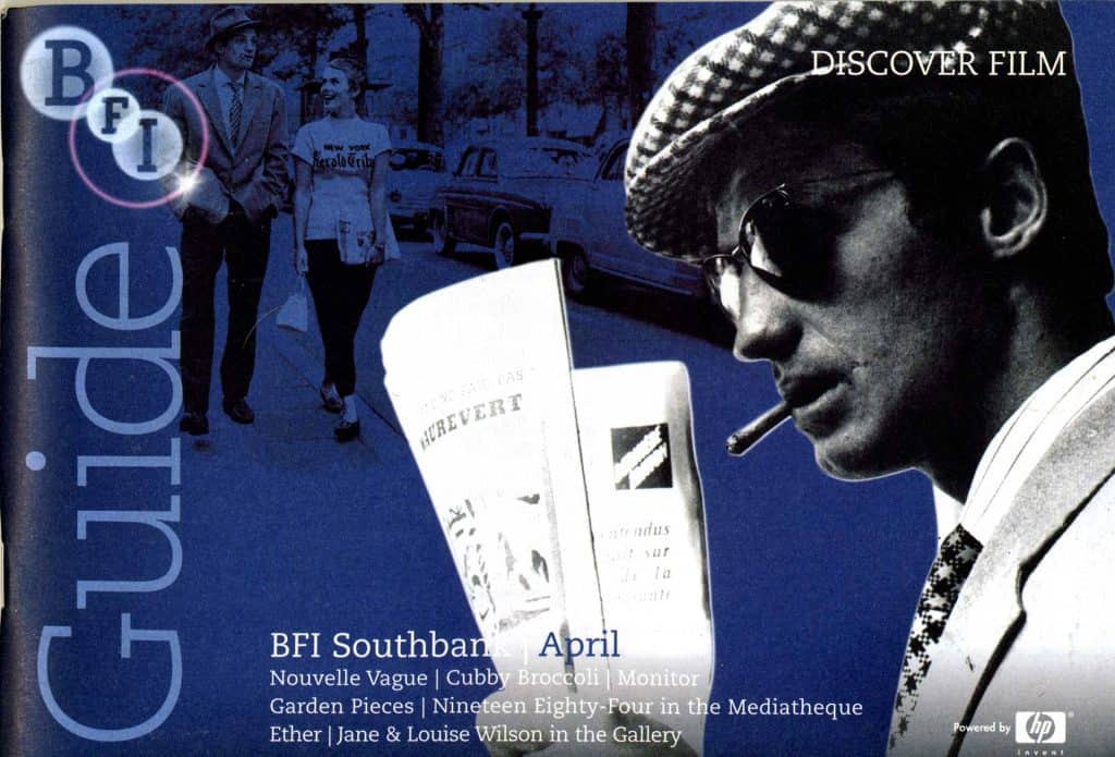
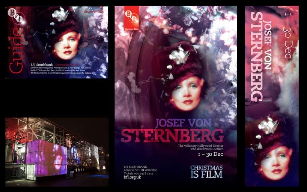
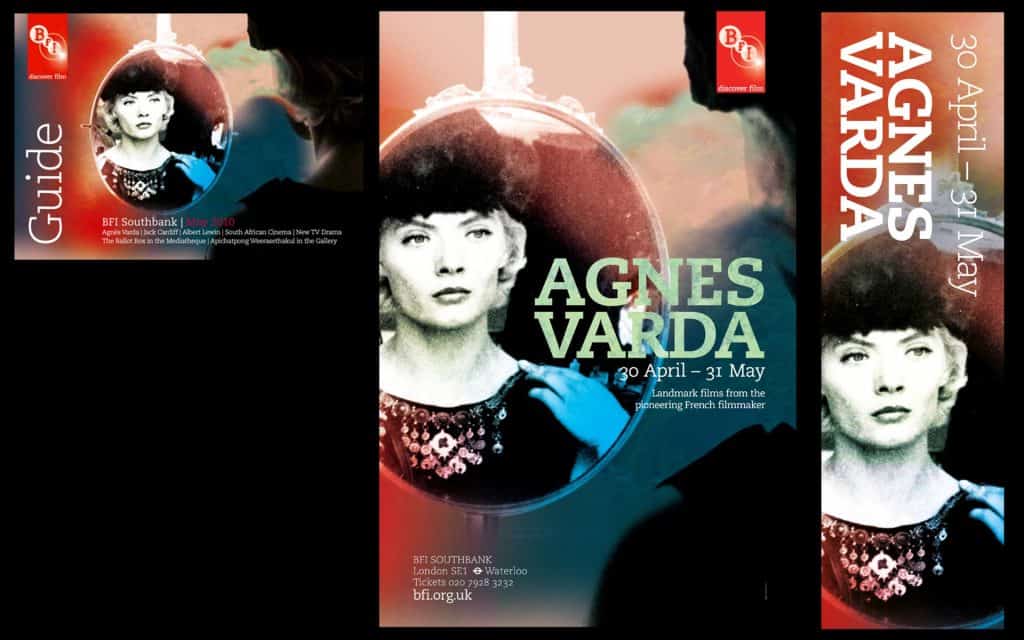
When I was leading the design team at the British Film Institute Opens in new window in London, I alternated directing the other wonderfully talented designers in the team (Marc Marazzi, Riccardo Spina, Miki Tsuganuma) with a lot of hands-on creative work. I loved blending my digital image-creation skills with my drawings, paintings and photographs. I supervised the creation of a new visual language for the brand, and made sure the team maintained it across all brand outputs which were many. We produced a wealth of different materials for all types of nation-wide campaigns, for the distribution department, etc. Here are a few posters, guides covers, banners etc favourites that I personally designed, out of SO many. I hope you can tell that the visual language resulted into a very strong brand, perfectly in tune with the nature of the institution.
The slab serif typeface, I hasten to add, was not our choice: it was the branding imposed on us at the time. We soldiered through it, dreaming of our favourite fonts every time we had to typeset the drab, clunky Caecilia on an otherwise fab poster design.

