Nobody cares about your brand typeface. Stop wasting time on picking the right fonts!
…
If you know me at all, you probably have guessed already that I’m only kidding.
Yes – yes, people do care about your brand typeface. They specifically care that you pick an accessible typeface: so that they can actually read your message and buy your products.
The web is about 95% text (a bold estimation I can’t prove to you, but neither can you prove me wrong). And yet, so many websites still mess their text up.
Bad typographical choices, both in terms of inaccessible typefaces and the way they are styled and laid out, are the #1 mistake I see in 99% of the pages I audit.
Your choice of typeface – and how you design with it, but that’s for another post – can make or break the accessibility and profitability of your product.
Do you want to get easier conversions? Then make sure that people, as well as screen readers and other assistive tech, can actually read you.
Better results start from an accessible typeface
Yes, I firmly believe this: improved results in your conversions start from choosing an accessible typeface.
When you pick a typeface, aesthetics do matter. I’ll grant you that. But you should not pick a typeface just because it’s pretty, or particularly original, or because it suits your brand: it should be accessible, too.
(After you’ve done that, you should also typeset and design accessibly – but that’s a longer conversation – long enough for me and Joe Natoli to build a typography masterclass around it!)
The interesting thing is that even though the Web Content Accessibility Guidelines (WCAG) do address text content, they more or less stop there: they don’t touch on any other aspects of typography that are essential to make your text understandable by everyone, both humans and machines.
I’ve made it my mission to make the web a better place, one typeface at a time.
Here are as many as 8 tips that will help you in your choice of an accessible typeface.
TL;DR version: Notion checklist
No time to read the whole article? No problem. I have put together the quick reference guide “How to pick an accessible typeface” as a Notion checklist. Shoot me an email, and I’ll send it over to you.
8 tips on how to pick an accessible typeface
I’m not saying that this is all there is about picking an accessible typeface. But it will help you a lot.
Here we go!
1. Easy to read
Choose a typeface that’s easy to read.
Specifically, avoid scripts and fancy fonts: don’t get tempted by handwriting typefaces, they’re problematic and mostly not accessible, because the characters are very hard to tell from one another, especially when they use ligatures (see tip 8 below). This affects legibility and increases the cognitive load for everyone, with neurodiverse people having the worst time of it.
Look at the image below, with the heading written in a flamboyant handwriting typeface: not only is the type really hard to read, it also bounces up and down, and it’s set against a visually noisy background. It’s almost as if the website doesn’t actually want me to work out the meaning of this heading.

When I change the handwritten typeface to a generic serif, I can finally read it. What a relief! The background still clashes with the words, and the contrast is also a bit low, but at least I can discern the letters and the phrase can form: “Unlock your money patterns”.

This is the overarching rule number 1, the one rule to lord it over them all: choose a typeface that’s easy to read. The following tips will clarify further specifics, too.
2. Simple, but not too simple
Easy to read doesn’t necessarily mean “simple”. In fact, you should make sure you choose a typeface that’s simple, but not too simple. Confused? Don’t be. I’ll explain.
When I write “l” on LinkedIn or Facebook, how do you know whether I mean the lowercase “l” for Lima, or uppercase “I” for the first person singular pronoun?
You don’t know, that’s the answer.
Letters that look the same but are not the same are called “imposter characters”. Another example of imposter character is when the letter “b” and the letter “d” are simply the same character, only mirrored. However, usually the most egregious example of imposter characters, and the most problematic, are the lowercase “l” for Lima, or uppercase “I” for the first person singular pronoun.
Look at the image below to get a visual of what I mean. The word “Illicit” set in Arial starts with 3 practically identical vertical strokes. (The capital “I” is actually a fraction thinner, but I’m nitpicking).

You can tell the difference between the lowercase “l”, or uppercase “I” when you read this article on my website, because I use an accessible sans serif typeface called Atkinson Hyperlegible (specifically developed by the Braille Institute to be legible). See the word “Illicit” below, set in Atkinson this time: perfectly legible, with no hesitation, no imposters, no confusion, and no cognitive overload.

Some articles that you may find online list typefaces such as Arial itself, together with Verdana, Tahoma, Helvetica, and Calibri as accessible, apparently basing the decision on the fact that they are basic, simple, and unadorned. But they are also too basic, as we’ve just seen, which ultimately makes them not accessible.
The disappointing truth is that the overwhelming majority of sans serif typefaces are actually not accessible, because they sport a variety of imposter characters. But there’s hope! For instance, National by Klim Type Foundry is a beautiful, accessible and affordable sans serif typeface. Let’s hope the craze catches on.
In a nutshell: avoid typefaces with “imposter characters”, and pick a sans serif with individually recognisable characters. (Or you could pick a serif typeface, and you wouldn’t have this specific problem).
3. No ambiguity
Pick a typeface that’s unambiguous.
We’ve just seen how excessive simplicity doesn’t always help to make an accessible typeface.
On the other end of the spectrum, some typefaces try to be too clever or creative: this can result in confusing letterforms that look like something else.
I’m thinking of a particularly flamboyant and creative handwriting or script typeface, or even a sans serif that’s trying to be too cool.
When a character can be confused for another letter or a symbol, it makes the typeface not accessible: people with dyslexia or low vision, for instance, will find it very hard to read.
An example is the Social Gothic typeface, seen in the image below in a paragraph from the documentary “Pushout”, on the criminalisation of Black girls in US schools. Social Gothic mixes lowercase and uppercase letters, and has no descenders or ascenders. This alone means that the lines and blocks of text are visualised as all caps: in itself a big problem for people with dyslexia for instance, who will see the lines of text as a long strip first, followed by a struggle to discern individual characters.

Mixing the 2 cases causes confusion, and ignores the principle of familiarity, a tenet of design: as humans, we prefer familiar patterns, because our brain’s main aim is to consume as little energy as possible (Don’t Make Me Think should be your motto, and your bible).
Moreover, some of the letterforms in Social Gothic resemble one another: look at the “x”, the “h” and the “k”. So easy to confuse!
As if it weren’t enough, the paragraph above is centred (very bad for readability) and it’s set in white against a very bright red background, which doesn’t pass a contrast checking test.

There, I’ve fixed it: even if the generic Sans Serif isn’t particularly accessible (as we’ve seen above), it is a damn sight more legible (which refers to telling each character apart) and readable (which refers to the ease of reading long chunks of text). It is also more visible, thanks to the darker background, which improves contrast.
I’d also divide into 2 paragraphs, but I digress!
Summing up: avoid ambiguous typefaces that try too hard, and find another way to be creative – the possibilities are infinite! This way, your important message won’t be lost.
4. Good contrast
Pick a typeface that has enough contrast against the background.
This time, I’m not talking about colour contrast: I’m talking about choosing a typeface that’s too thin, or with no contrast within the type anatomy: even at the right size and with the correct colour contrast, it will be very hard to read. And yet, I see this so often when I carry out an audit!

In the image below, I’ve used Brandon Text set in its Thin version on the left, and Medium on the right. Does the Thin version look prettier? yes it does. But can I read it? No, I can’t. The Medium version is sturdier and more practical, and ultimately I can read it, which is kind of the litmus test, isn’t it (what is the point of text, if people can’t see it).
This is the way to go, my friend. Don’t be shy: be visible.

By the way, this example uncovers one of the ways we can demonstrate that WCAG compliance does not equal accessibility.
There are no WCAG criteria regarding typeface thinness. And yet, a thin typeface is eminently not accessible, even with the colour contrast is correct, as is the case in the image above.
This is another one of those accessibility issues that will probably never make its way into the WCAG, nor does it get picked by automated accessibility checkers such as WAVE, which only checks the colour contrast and finds it within guidelines.
Still, a thin typeface will and does make entire sites almost invisible to people with low vision.
So please, pick a typeface weight that makes the text visible.
5. The x-factor.
Pick a typeface with a taller “x height”.
This is the height of the lowercase “x”. Here’s why:
A taller “x” means lower uppercase letters, shorter ascenders (i.e. the vertical stroke of the letter “h”) and descenders (i.e. the vertical stroke of the letter “p”). This will allow for lower line height, and improve readability. It will also avoid the dreaded bump of ascenders and descenders, when the line height is too short.
When the x height is too low proportionally to the typeface, it means that ascenders and descenders practically bump into one another, unless you set the line height to be quite high. And that’s not good for cognitive load or readability: too much space between lines tricks the brain into believing that the lines don’t belong to the same group (see the Gestalt principle of proximity). Tighter line height generally improves readability.
The typeface Brandon Grotesque is lovely, but it has a low x height in relation to the length of its ascenders and descenders. So you need a really tall line height to make sure you avoid the dreaded bump, as the image below shows.

If we use Brandon Text, the x height is much higher in relation to ascenders and descenders, so with the same line height you get much more space for your letters (careful not to set the line height too high, or it will cause the eye to wander and attention will be lost).

Brandon Grotesque’s x height is the reason why I abandoned it (farewell, Brandon!) in favour of the all-together inclusive Atkinson that I am using now.
Morale of the story: Please, pick a typeface with generous x height, and always check ascenders and descenders.
6. Open spaces
Choose a typeface with a larger “aperture” and “counter spaces”.
Not the photographic aperture: rather, the open curves in the letter “c”, for instance. Wider aperture means better legibility, especially at small sizes. Counter space in typography is the area of a letterform that’s partially or totally enclosed, such as for instance in the letter “a” or “e”. More spacious letterforms are generally more legible.

Once again for those in the back: Arial is not an accessible typeface. Not only does it have imposter letters: it also has very small apertures.
Go for larger apertures and counters that make the type breathe, and the eye see.
7. Give them space
Similar to the above, you need a typeface that’s designed considering the spacing between letters.
Horizontal spacing between all letters in a word or section of text is called “tracking”: it should be just right, not too much, not too little, and regularly distributed.
Some typefaces are born with the correct spacing, while some aren’t.
8. Set them free
Choose a typeface that doesn’t force “ligatures”.
A ligature is when letters are joined together. It can be an aesthetic choice sometimes, although it’s a debatable one, with those typefaces that offer you the option to use ligatures or not.

Brandon Text, for instance, gives you the option to choose to typeset with ligatures, or without. Once more, it’s up to you: do you want your text to look pretty? or do you want it to be legible? The word “office” in the image above is hard to read on the left, with ligatures enabled: the 2 “f”s and the “i” are practically fused together, and the “i” has no dot. It looks like an icon to me, not like letters that are part of a word.
But at least Brandon gives you the choice. There are typefaces that simply are born with the letters joined together – yes, I’m looking at you once again, script and handwritten typefaces.


If you truly want to get your message across and make it visible and understandable by all – that is to say, inclusive and accessible – please don’t use typefaces that force ligatures, and make sure you turn ligatures off for typefaces that offer the option.
Real-world example
Are you bummed out? Are you thinking that the task of picking an accessible typeface is impossible?
Well, it is true that it is not so easy to find a sans serif typeface that is completely accessible (Atkinson Hyperlegible is one of the few). Also, contrary to urban legends you might have heard, many of the caveats explained in this article actually don’t apply to serif typefaces. So you could go for a serif instead.
But if you truly want an accessible sans serif, there are a few around.
When Roger Rosweide and Sybren van Kesteren hired me to re-design the wildcloud (by WPCS) website, I simply told them:
“We’re going to need a more accessible typeface”.
And I found it! The versatile, friendly, charismatic National by Klim. I’m in love. National is one of those typefaces that makes it possible to create a lovely design virtually by typography alone. What do you think? Do you like it?
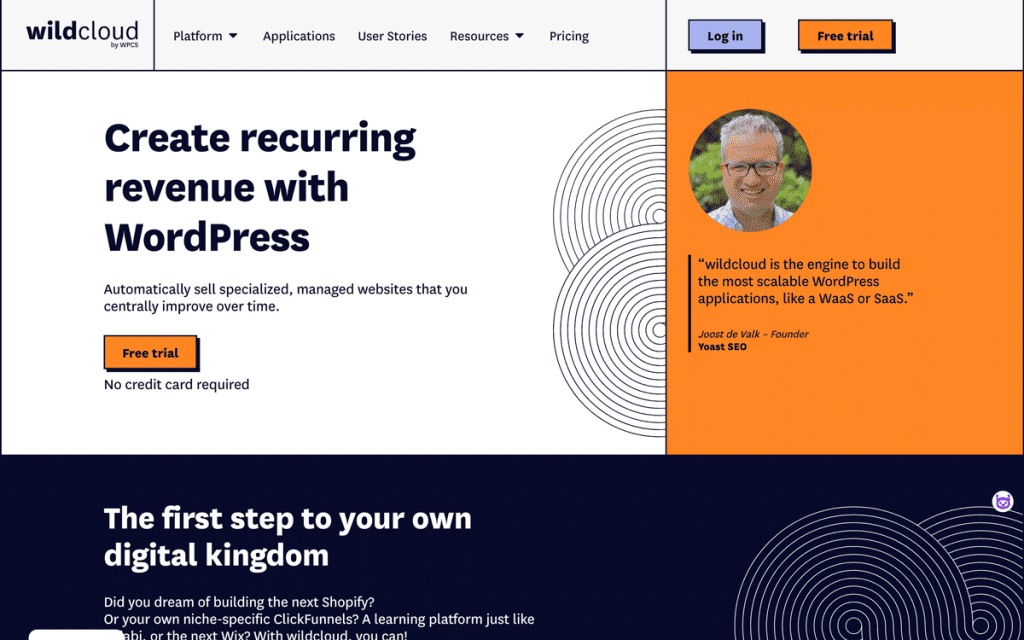
I think it’s simply stunning, and with the perfect licensing options.
Recapping
Your accessible typeface must be:
- Easy to read
- Simple but not too simple
- No ambiguity
- Good contrast
- The x factor
- Generous apertures and counters
- Horizontal spacing
- No ligatures
Are you sure that the type on your site is accessible? Ask me if in doubt!
p.s. get yourself the Notion checklist version of this article, for quick reference:
